# load libraries
library(tibble)
library(dplyr)
library(tidyr)
library(readr)
library(stringr)
library(ggplot2)
library(tidyHeatmap)
library(tidybulk)
library(ggrepel)
library(airway)
How to start from tables
# create some example tables to use
data(airway)

# counts table
counts <- assay(airway) %>%
  as_tibble(rownames = "geneID")

# sample information table
sampleinfo <- colData(airway) %>%
  as_tibble(rownames = "sample")

# data preprocessing

counts_tt <-
    # convert to tidy format
    pivot_longer(counts, cols = starts_with("SRR"), names_to = "sample", values_to = "counts") %>%

    # get gene symbols
    ensembl_to_symbol(geneID) %>%

    # order the columns for tidybulk
    select(sample, geneID, counts, transcript) %>%

    # add the sample info
    left_join(sampleinfo) %>%

    # shorten sample name
    mutate(sample=str_remove(sample, "SRR1039")) %>%

    # convert to tidybulk tibble
    tidybulk(.sample=sample, .transcript=geneID, .abundance=counts)
## Joining, by = "sample"How to count reads per sample
## # A tibble: 8 x 2
##   sample total_reads
##   <chr>        <int>
## 1 508       20637971
## 2 509       18809481
## 3 512       25348649
## 4 513       15163415
## 5 516       24448408
## 6 517       30818215
## 7 520       19126151
## 8 521       21164133
We can also check how many counts we have for each sample by making a bar plot. This helps us see whether there are any major discrepancies between the samples more easily.
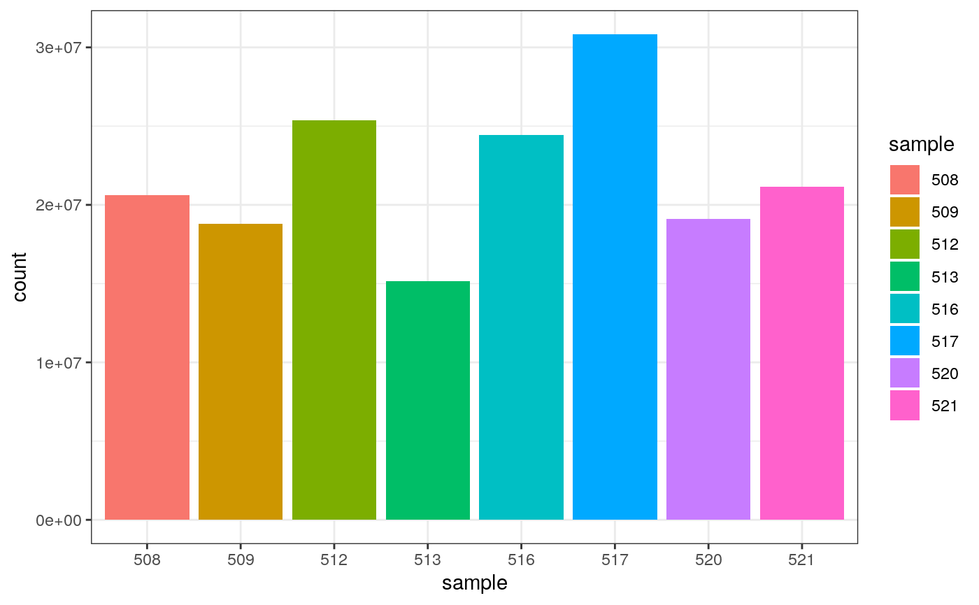
As we are using ggplot2, we can also easily view by any other variable that’s a column in our dataset, such as cell line, simply by changing fill.
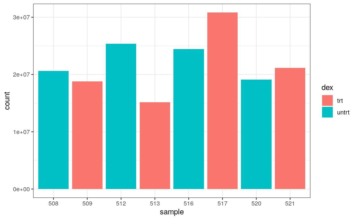
We can colour by dex treatment.
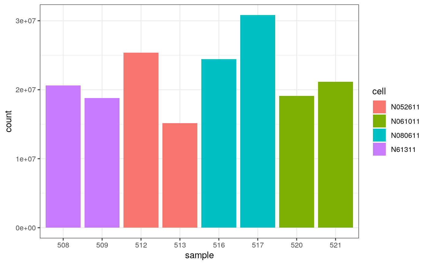
 We can colour by cell line.
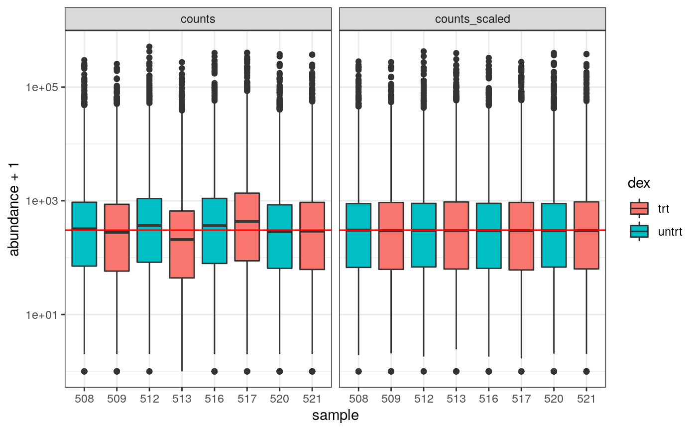
How to examine normalised counts with boxplots
# scale counts
counts_scaled <- counts_tt %>% scale_abundance(factor_of_interest = dex)

# create box plots
counts_scaled %>%
    filter(!lowly_abundant) %>%
    pivot_longer(cols = c("counts", "counts_scaled"), names_to = "source", values_to = "abundance") %>%
    ggplot(aes(x=sample, y=abundance + 1, fill=dex)) +
    geom_boxplot() +
    geom_hline(aes(yintercept = median(abundance + 1)), colour="red") +
    facet_wrap(~source) +
    scale_y_log10() +
    theme_bw()
How to create MDS plot
airway %>%
    tidybulk() %>%
    scale_abundance(factor_of_interest=dex) %>%
    reduce_dimensions(method="MDS", scale = F) %>%
    pivot_sample() %>%
    ggplot(aes(Dim1, Dim2, color = dex)) +
    geom_point()
## tidybulk says: to access the raw results do `attr(..., "internals")$MDS`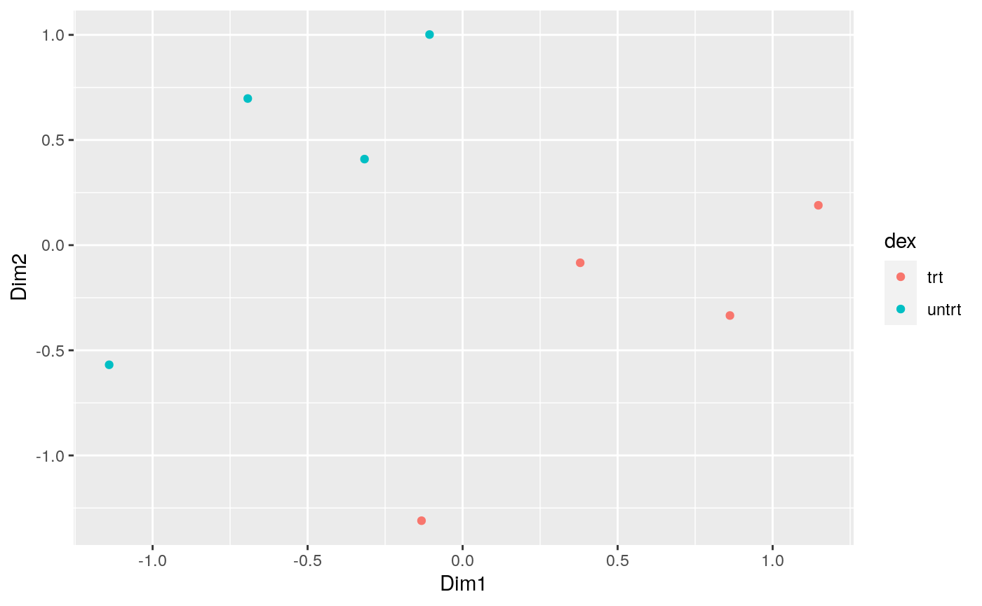
How to create MA plot
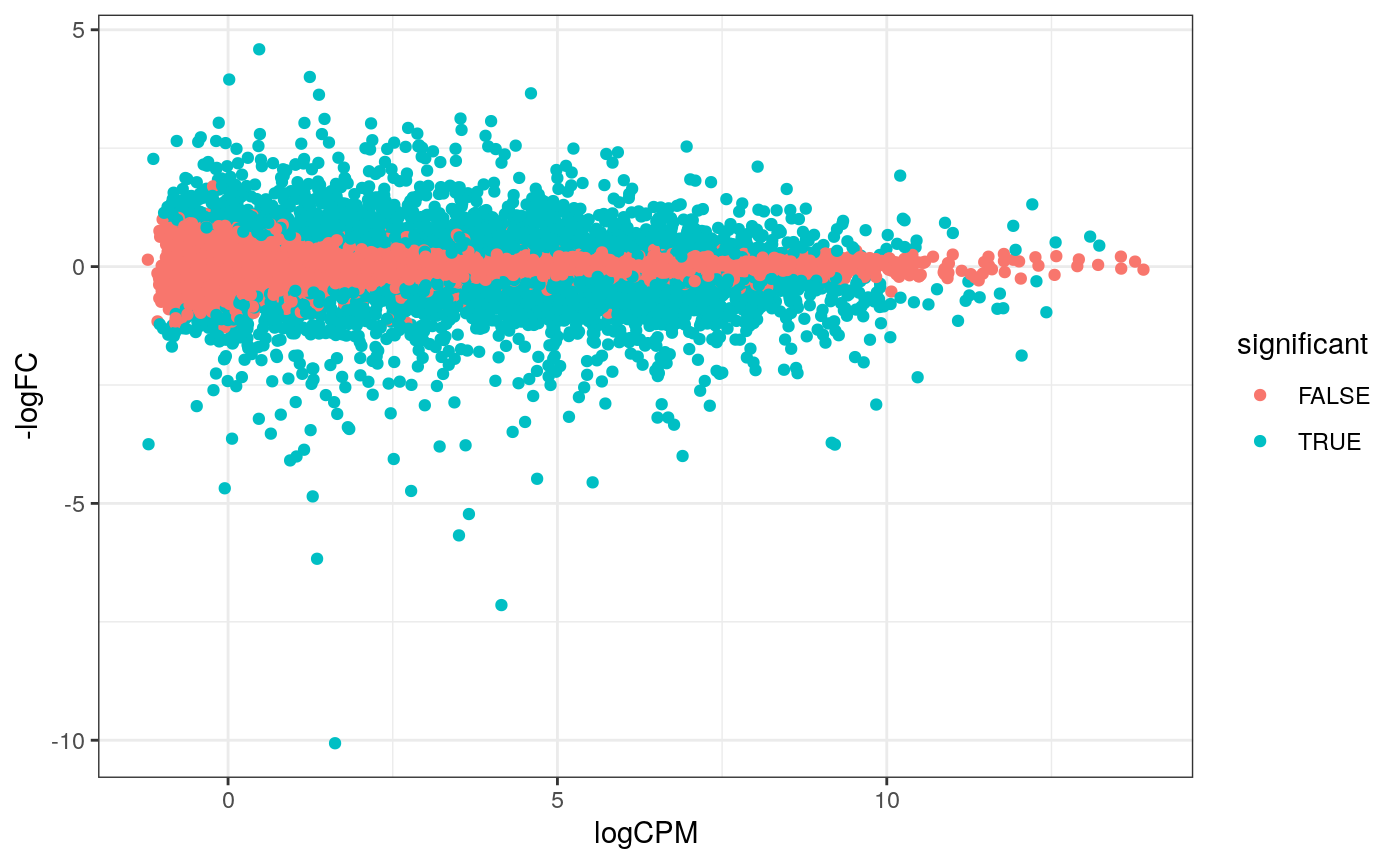
MA plots enable us to visualise amount of expression (logCPM) versus logFC. Highly expressed genes are towards the right of the plot. We can also colour significant genes (e.g. genes with FDR < 0.05)
# perform differential testing
counts_de <-
    counts_tt %>%
    test_differential_abundance(
        .formula = ~ 0 + dex + cell,
        .contrasts = c("dextrt - dexuntrt"),
        omit_contrast_in_colnames = TRUE
    )
## tidybulk says: The design column names are "dextrt, dexuntrt, cellN061011, cellN080611, cellN61311"## tidybulk says: to access the raw results (fitted GLM) do `attr(..., "internals")$edgeR`# maplot, minimal counts_de %>% pivot_transcript() %>% filter(!lowly_abundant) %>% ggplot(aes(x=logCPM, y=-logFC, colour=significant)) + geom_point()+ theme_bw()
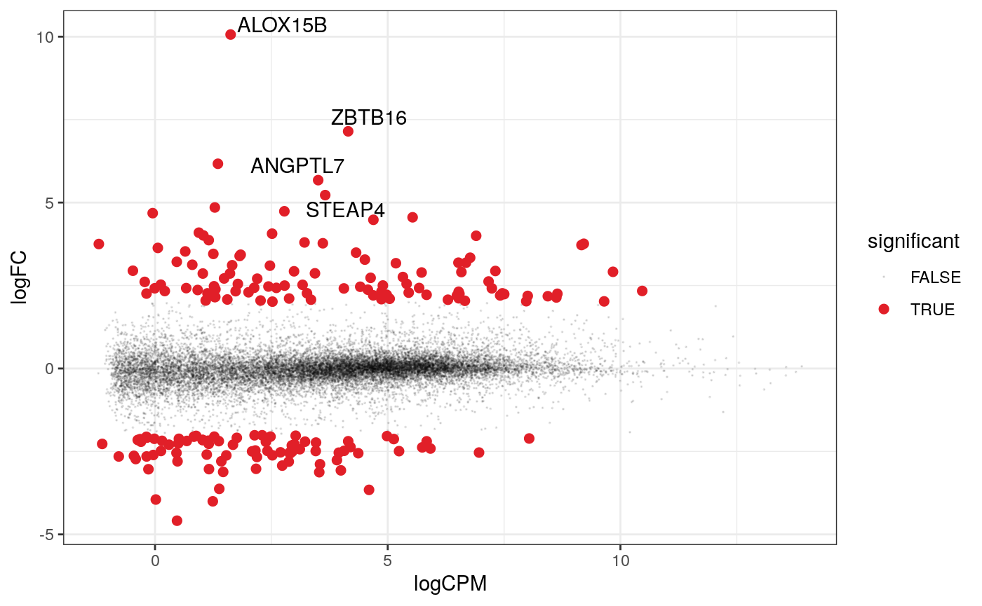
A more informative MA plot, integrating some of the packages in tidyverse.
counts_de %>%
    pivot_transcript() %>%

    # Subset data
    filter(!lowly_abundant) %>%
    mutate(significant = FDR<0.05 & abs(logFC) >=2) %>%
    mutate(transcript = ifelse(abs(logFC) >=5, as.character(transcript), "")) %>%

    # Plot
    ggplot(aes(x = logCPM, y = logFC, label=transcript)) +
    geom_point(aes(color = significant, size = significant, alpha=significant)) +
    geom_text_repel() +
    scale_color_manual(values=c("black", "#e11f28")) +
    scale_size_discrete(range = c(0, 2)) +
    theme_bw()
How to perform gene enrichment analysis
To run below you’ll need the clusterProfiler and org.Hs.eg.db packages. This is just one suggestion, adapted from here. If you have other suggestions for how to do a ‘tidy’ pathway analysis feel free to let us know.
library(clusterProfiler)
library(org.Hs.eg.db)

# extract all genes tested for DE
res <- counts_de %>%
    pivot_transcript() %>%
    filter(!lowly_abundant)

# GO terms
egoCC <- res %>%
    filter(FDR < 0.1 & logFC > 0 ) %>%
    pull( "transcript" ) %>%
    enrichGO(
      OrgDb = org.Hs.eg.db,
      keyType = 'SYMBOL',
      ont = "BP",
      universe = (res %>% pull( "transcript" ) ) )

dotplot(egoCC)
goplot(egoCC)
emapplot(egoCC)


# MSigDB Hallmark
gmtH <- read.gmt( "https://data.broadinstitute.org/gsea-msigdb/msigdb/release/6.2/h.all.v6.2.symbols.gmt" )
enrH <- enricher(
   gene = ( res %>% filter(FDR < 0.1 & logFC > 0) %>%
    pull( "transcript" ) ),
   TERM2GENE = gmtH,
   universe = ( res %>% pull( "transcript" ) ) )

dotplot( enrH )
emapplot(enrH)