# load libraries
library(airway)
library(tibble)
library(dplyr)
library(tidyr)
library(readr)
library(stringr)
library(purrr)
library(ggplot2)
library(ggrepel)
library(tidyHeatmap)
library(tidybulk)
Plot settings. Set the colours and theme we will use for our plots.
# Use colourblind-friendly colours
friendly_cols <- dittoSeq::dittoColors()

# Set theme
custom_theme <-
  list(
    scale_fill_manual(values = friendly_cols),
    scale_color_manual(values = friendly_cols),
    theme_bw() +
      theme(
        panel.border = element_blank(),
        axis.line = element_line(),
        panel.grid.major = element_line(size = 0.2),
        panel.grid.minor = element_line(size = 0.1),
        text = element_text(size = 12),
        legend.position = "bottom",
        #aspect.ratio = 1,
        strip.background = element_blank(),
        axis.title.x = element_text(margin = margin(t = 10, r = 10, b = 10, l = 10)),
        axis.title.y = element_text(margin = margin(t = 10, r = 10, b = 10, l = 10)),
        axis.text.x = element_text(angle = 30, hjust = 1, vjust = 1)
      )
  )
Part 1 Bulk RNA-seq
How to start from tables
# create some example tables to use
data(airway)

# counts table
counts <- assay(airway) %>%
  as_tibble(rownames = "gene_id")

# sample information table
sampleinfo <- colData(airway) %>%
  as_tibble(rownames = "sample")

# data preprocessing

counts_tt <-
    # convert to tidy format
    pivot_longer(counts, cols = starts_with("SRR"), names_to = "sample", values_to = "counts") %>%

    # get gene symbols
    mutate(symbol = AnnotationDbi::mapIds(org.Hs.eg.db::org.Hs.eg.db,
                                          keys = as.character(gene_id),
                                          keytype = "ENSEMBL",
                                          column="SYMBOL",
                                          multiVals = "first")) %>%

    # order the columns for tidybulk
    select(sample, gene_id, counts, symbol) %>%

    # add the sample info
    left_join(sampleinfo) %>%

    # shorten sample name
    mutate(sample=str_remove(sample, "SRR1039")) %>%

    # convert to tidybulk tibble
    tidybulk(.sample=sample, .transcript=gene_id, .abundance=counts)
## ## 'select()' returned 1:many mapping between keys and columns## Joining, by = "sample"How to count reads per sample
## # A tibble: 8 x 2
##   sample total_reads
##   <chr>        <int>
## 1 508       20637971
## 2 509       18809481
## 3 512       25348649
## 4 513       15163415
## 5 516       24448408
## 6 517       30818215
## 7 520       19126151
## 8 521       21164133
We can also check how many counts we have for each sample by making a bar plot. This helps us see whether there are any major discrepancies between the samples more easily.
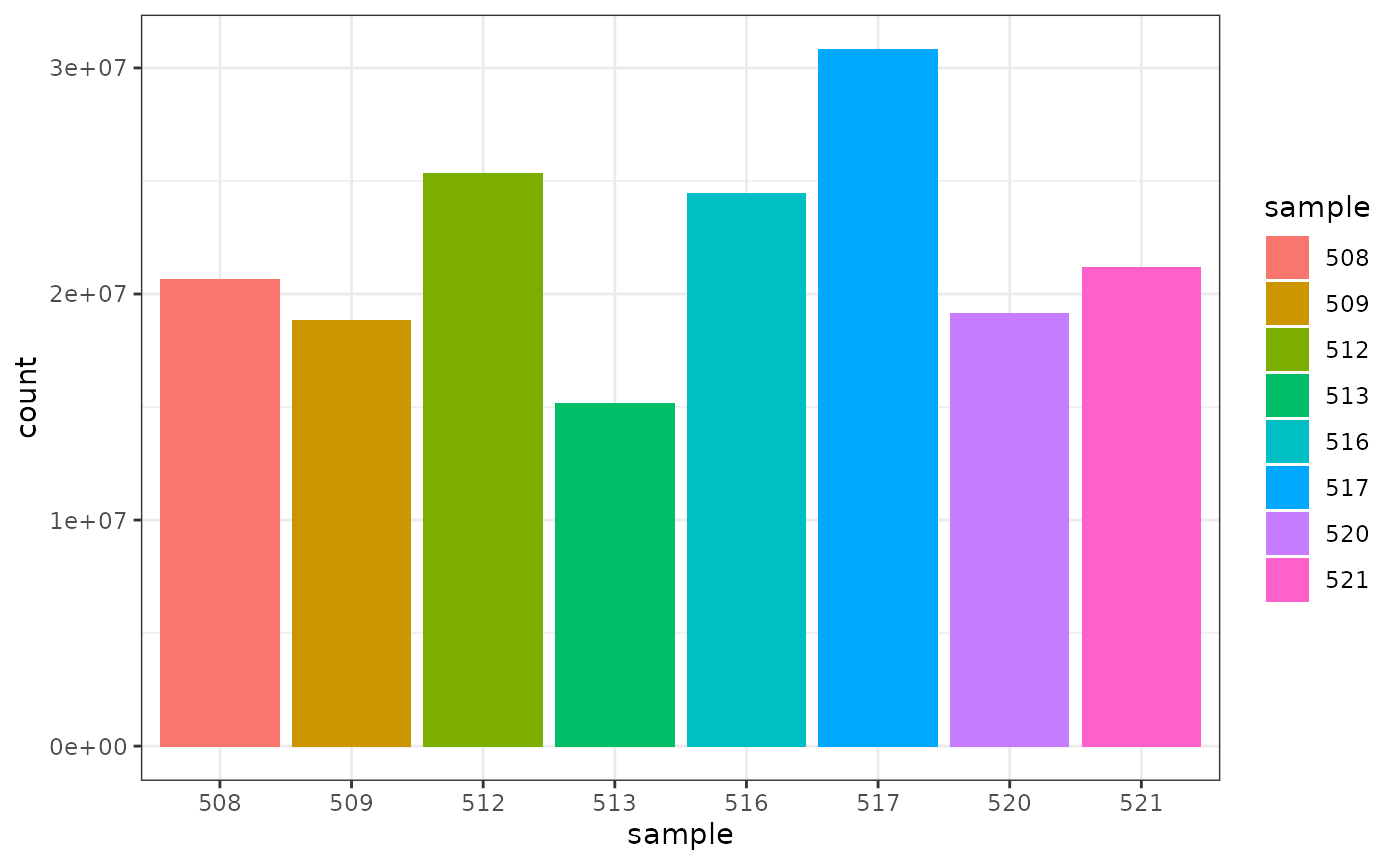
As we are using ggplot2, we can also easily view by any other variable that’s a column in our dataset, such as cell line, simply by changing fill.
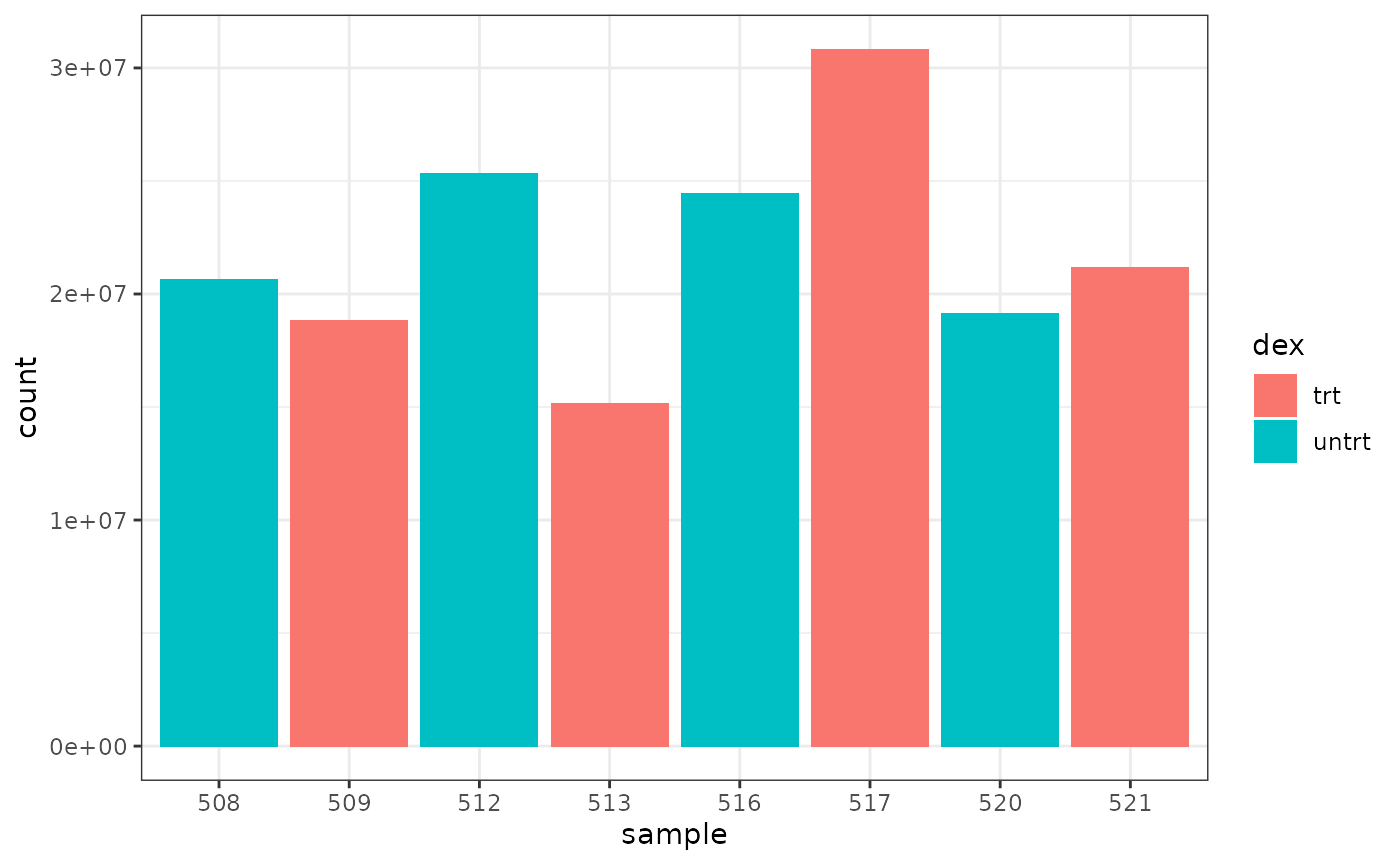
We can colour by dex treatment.
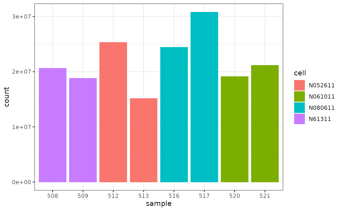
 We can colour by cell line.
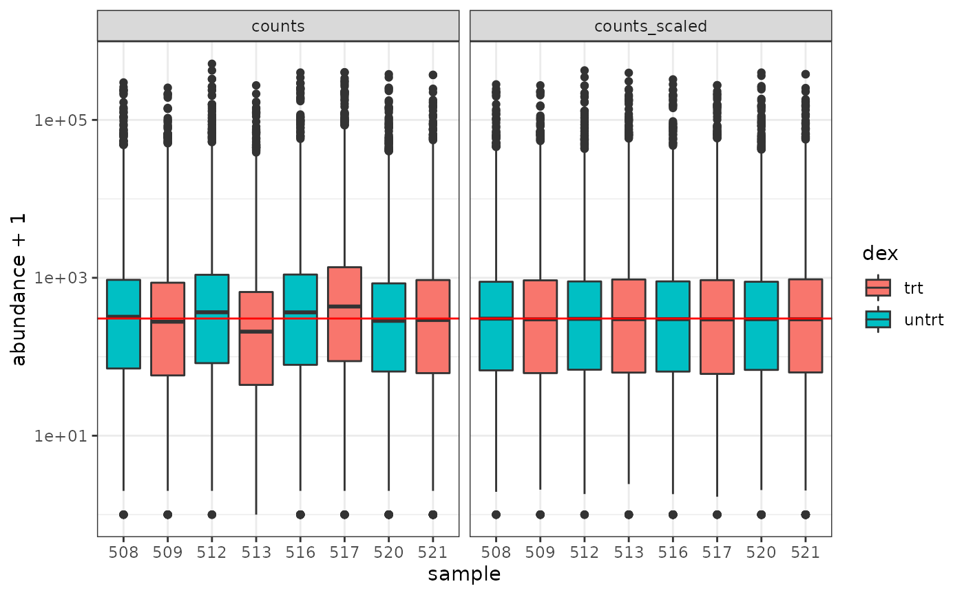
How to examine normalised counts with boxplots
# filter counts
counts_filtered <- counts_tt %>% keep_abundant(factor_of_interest = dex)

# scale counts
counts_scaled <- counts_filtered %>% scale_abundance()

# create box plots
counts_scaled %>%
    pivot_longer(cols = c("counts", "counts_scaled"), names_to = "source", values_to = "abundance") %>%
    ggplot(aes(x=sample, y=abundance + 1, fill=dex)) +
    geom_boxplot() +
    geom_hline(aes(yintercept = median(abundance + 1)), colour="red") +
    facet_wrap(~source) +
    scale_y_log10() +
    theme_bw()
How to create MDS plot
airway %>%
    tidybulk() %>%
  keep_abundant(factor_of_interest = dex) %>%
    scale_abundance() %>%
    reduce_dimensions(method="MDS", scale = FALSE) %>%
    pivot_sample() %>%
    ggplot(aes(Dim1, Dim2, color = dex)) +
    geom_point()
## tidybulk says: to access the raw results do `attr(..., "internals")$MDS`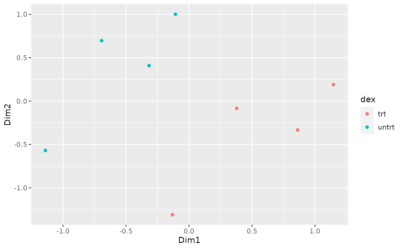
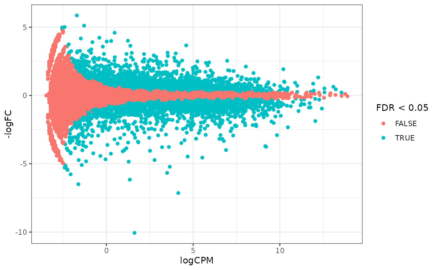
How to create MA plot
MA plots enable us to visualise amount of expression (logCPM) versus logFC. Highly expressed genes are towards the right of the plot. We can also colour significant genes (e.g. genes with FDR < 0.05)
# perform differential testing
counts_de <-
    counts_tt %>%
    test_differential_abundance(
        .formula = ~ 0 + dex + cell,
        .contrasts = c("dextrt - dexuntrt"),
        omit_contrast_in_colnames = TRUE
    )
## tidybulk says: All methods use raw counts,
## irrespective of if scale_abundance or adjust_abundance have been calculated,
## therefore it is essential to add covariates such as batch effects (if applicable) in the formula.
## Warning in eval(dots[[i]][[action]], env, env): tidybulk says: highly abundant
## transcripts were not identified (i.e. identify_abundant()) or filtered (i.e.,
## keep_abundant), therefore this operation will be performed on unfiltered
## data. In rare occasions this could be wanted. In standard whole-transcriptome
## workflows is generally unwanted.## tidybulk says: The design column names are "dextrt, dexuntrt, cellN061011, cellN080611, cellN61311"## tidybulk says: to access the raw results (fitted GLM) do `attr(..., "internals")$edgeR`# maplot, minimal counts_de %>% pivot_transcript() %>% ggplot(aes(x=logCPM, y=-logFC, colour=FDR < 0.05)) + geom_point()+ theme_bw()
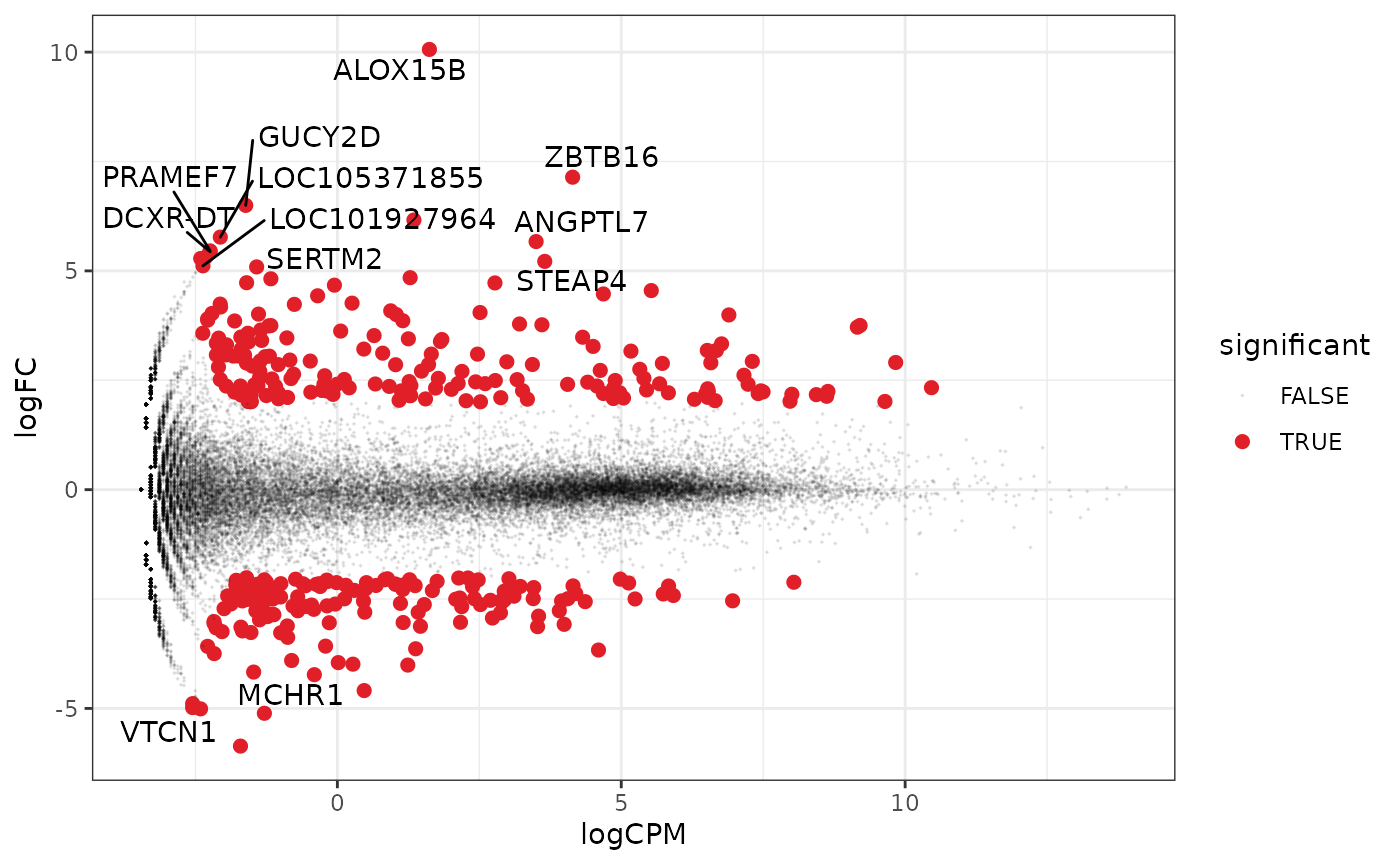
A more informative MA plot, integrating some of the packages in tidyverse.
counts_de %>%
    pivot_transcript() %>%

    # Subset data
    mutate(significant = FDR<0.05 & abs(logFC) >=2) %>%
    mutate(symbol = ifelse(abs(logFC) >=5, as.character(symbol), "")) %>%

    # Plot
    ggplot(aes(x = logCPM, y = logFC, label=symbol)) +
    geom_point(aes(color = significant, size = significant, alpha=significant)) +
    geom_text_repel() +
    scale_color_manual(values=c("black", "#e11f28")) +
    scale_size_discrete(range = c(0, 2)) +
    theme_bw()
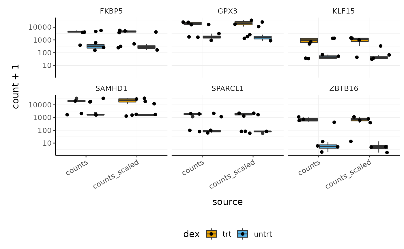
How to visualise both raw and scaled counts for genes
# extract some genes
topgenes_symbols <-
    counts_de %>%
    pivot_transcript() %>%
    arrange(PValue) %>%
    head(6) %>%
  pull(symbol)


# make stripchart
counts_scaled %>%

    # extract counts for top differentially expressed genes
    filter(symbol %in% topgenes_symbols) %>%

    # reshape
    pivot_longer(
        c(counts, counts_scaled),
        names_to = "source",
        values_to = "count"
    ) %>%

    # make faceted stripchart
    ggplot(aes(x = source, y = count + 1, fill = dex)) +
    geom_boxplot() +
    geom_jitter() +
    facet_wrap(~symbol) +
    scale_y_log10() +
    custom_theme
How to perform gene enrichment analysis
To run below you’ll need the clusterProfiler and org.Hs.eg.db packages. This is just one suggestion, adapted from here. If you have other suggestions for how to do a ‘tidy’ pathway analysis feel free to let us know.
library(clusterProfiler)
library(org.Hs.eg.db)

# extract all genes tested for DE
res <- counts_de %>%
    pivot_transcript()

# GO terms
egoCC <- res %>%
    filter(FDR < 0.1 & logFC > 0 ) %>%
    pull( "transcript" ) %>%
    enrichGO(
      OrgDb = org.Hs.eg.db,
      keyType = 'SYMBOL',
      ont = "BP",
      universe = (res %>% pull( "transcript" ) ) )

dotplot(egoCC)
goplot(egoCC)
emapplot(egoCC)


# MSigDB Hallmark
gmtH <- read.gmt( "https://data.broadinstitute.org/gsea-msigdb/msigdb/release/6.2/h.all.v6.2.symbols.gmt" )
enrH <- enricher(
   gene = ( res %>% filter(FDR < 0.1 & logFC > 0) %>%
    pull( "transcript" ) ),
   TERM2GENE = gmtH,
   universe = ( res %>% pull( "transcript" ) ) )

dotplot( enrH )
emapplot(enrH)
Nested analyses
tidybulk allows for data nesting, using the tidyr utility nest. This is an extremely powerful tool as it enables easily performing analyses on data subsets.
How to perform same analysis on subsets
Let’s suppose we want to perform differential transcript abundance analysis independently for two different data subsets to compare results after the test
pasilla_de <-
  biocasia2020tidytranscriptomics::pasilla %>%

  # Convert SummarizedExperiment object to tibble
  tidybulk %>%

  # Filter counts
  identify_abundant(factor_of_interest=condition) %>%

  # Scale abundance
  scale_abundance() %>%

  # Nest
  nest(data = -type) %>%

  # Differential analysis
  mutate(data = map(
    data,
    ~  test_differential_abundance(.x, ~ condition)
  )) %>%

  unnest(data)
## tidybulk says: All methods use raw counts,
## irrespective of if scale_abundance or adjust_abundance have been calculated,
## therefore it is essential to add covariates such as batch effects (if applicable) in the formula.
## tidybulk says: The design column names are "(Intercept), conditionuntreated"## tidybulk says: to access the raw results (fitted GLM) do `attr(..., "internals")$edgeR`## tidybulk says: All methods use raw counts,
## irrespective of if scale_abundance or adjust_abundance have been calculated,
## therefore it is essential to add covariates such as batch effects (if applicable) in the formula.## tidybulk says: The design column names are "(Intercept), conditionuntreated"## tidybulk says: to access the raw results (fitted GLM) do `attr(..., "internals")$edgeR`Now we can for example compare the number of differentially transcribed genes and their co-expression
pasilla_de %>%
  nest(data = -type) %>%
  mutate(
    number_of_differential = map_int(
      data, ~ .x %>% pivot_transcript() %>% filter(FDR < 0.05) %>% nrow
    ))
## # A tibble: 2 x 3
## type data number_of_differential
## <fct> <list> <int>
## 1 single_end <tibble [43,797 × 13]> 40
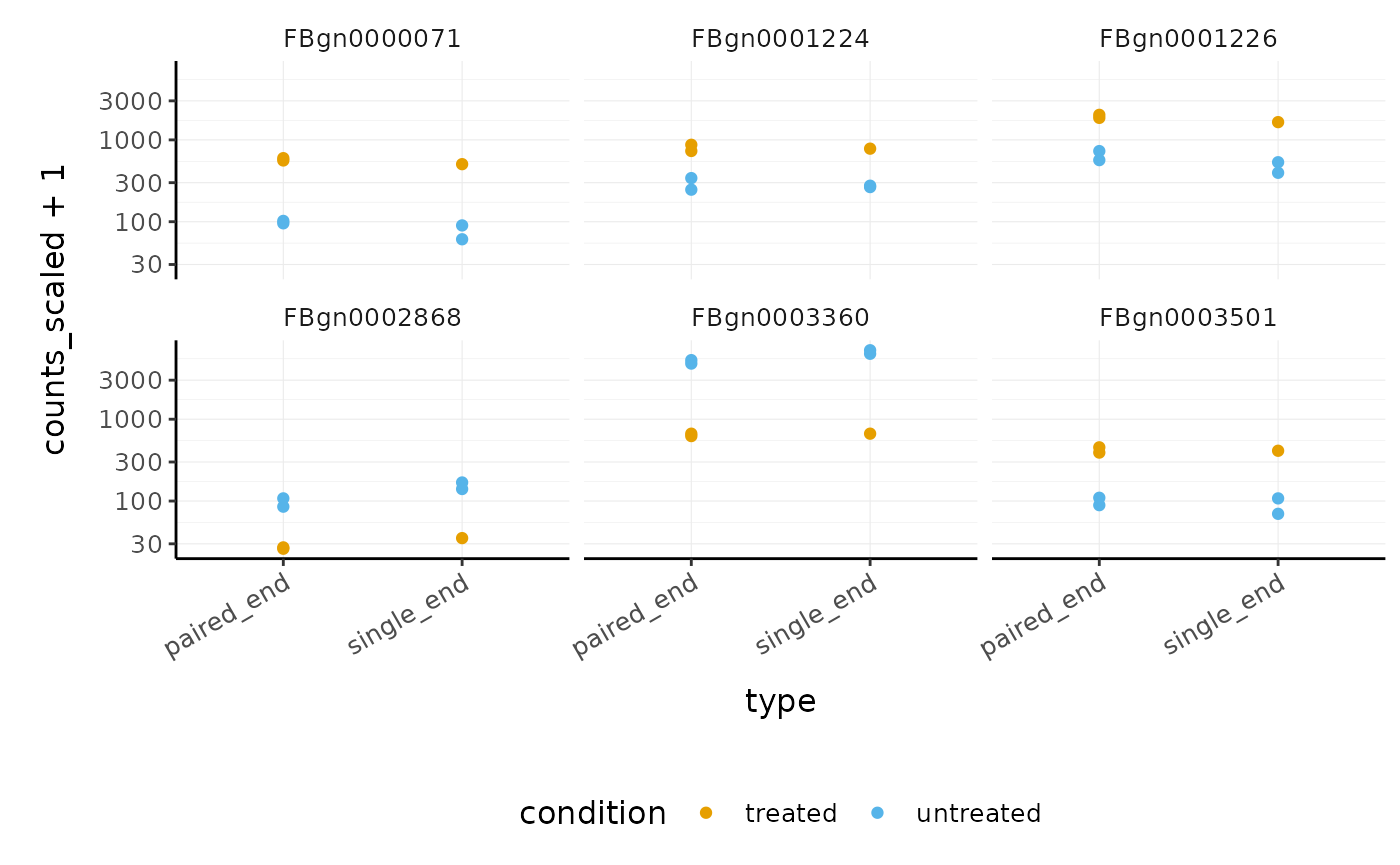
## 2 paired_end <tibble [58,396 × 13]> 1270We can easily see which genes overlap, and plot them
pasilla_de %>%
  filter(FDR < 0.05) %>%
  nest(data = -feature) %>%
  mutate(occurrences = map_int(data, ~ .x %>% distinct(type) %>% nrow)) %>%

  # We filter some of them
  filter(occurrences == 2) %>%
  dplyr::slice(1:6) %>%
  unnest(data) %>%

  # And plot
  ggplot(aes(type, counts_scaled +1, color=condition)) +
  geom_point() +
  facet_wrap(~feature) +
  scale_y_log10() +
  custom_theme
How to perform analysis on subset and apply to full dataset
Let’s suppose we want to identify the markers that distinguish epithelial from endothelial cells, and we also want to then visualise the abundance of those transcripts across many cell types to understand their cell type specificity.
cell_type_tt = biocasia2020tidytranscriptomics::cell_type_df %>% tidybulk(sample, symbol, count)
markers_df =
  cell_type_tt %>%

  # Filter counts
  identify_abundant(factor_of_interest=cell_type) %>%

  # Scale abundance
  scale_abundance() %>%

  # Nest
  nest(data = everything()) %>%

  # Investigate one cell type pair
  mutate(comparison_data = map(
    data,
    ~ .x %>%
      filter(cell_type %in% c("endothelial", "epithelial")) %>%
      mutate(cell_type = as.character(cell_type) )
  )) %>%

  #test. We run on the two populations but we select data for all populations
  mutate(markers = map(
    comparison_data,
    ~ .x %>%

      # Differential transcription
      test_differential_abundance(
        ~ 0 + cell_type,
        .contrasts = c("cell_typeendothelial - cell_typeepithelial"),
        action="only",
        omit_contrast_in_colnames = TRUE
      ) %>%

      # Select markers
      filter(logFC > 2) %>%
      dplyr::slice(1:10) %>%
      pull(symbol)

  )) %>%

  # Add marker info to original data
  mutate(data = map2(data, markers, ~ .x %>% filter(symbol%in% .y))) %>%
  select(data) %>%
  unnest(data)
Now we can see the abundance of the markers in all our cell types.
markers_df %>%
    ggplot(aes(cell_type, count_scaled +1 )) +
    geom_boxplot(outlier.shape = NA) +
    geom_jitter(size=0.3) +
    facet_wrap(~symbol, ncol=5) +
    coord_flip() +
    scale_y_log10() +
    custom_theme