Introduction to Tidy Transcriptomics
Maria Doyle, Peter MacCallum Cancer Centre1
Stefano Mangiola, Walter and Eliza Hall Institute2
Source:vignettes/tidytranscriptomics.Rmd
tidytranscriptomics.RmdBackground
Background information and setup instructions for this workshop can be found here.
Part 1 Bulk RNA-seq Core
This workshop will present how to perform analysis of RNA sequencing data following the tidy data paradigm (Wickham and others 2014). The tidy data paradigm provides a standard way to organise data values within a dataset, where each variable is a column, each observation is a row, and data is manipulated using an easy-to-understand vocabulary. Most importantly, the data structure remains consistent across manipulation and analysis functions.
This can be achieved for RNA sequencing data with the tidybulk, tidyHeatmap (Mangiola and Papenfuss 2020) and tidyverse (Wickham et al. 2019) packages. The tidybulk package provides a tidy data structure and a modular framework for bulk transcriptional analyses. tidyHeatmap provides a tidy implementation of ComplexHeatmap. These packages are part of the tidytranscriptomics suite that introduces a tidy approach to RNA sequencing data representation and analysis
Acknowledgements
Some of the material in Part 1 was adapted from an R for RNA sequencing workshop first run here. Use of the airway and pasilla datasets was inspired by the DESeq2 vignette.
![]()
Poll: Will you code along and/or try out exercises during this workshop?Poll: Do you have experience with transcriptomic analyses?Poll: Do you have experience with tidyverse?Introduction
Measuring gene expression on a genome-wide scale has become common practice over the last two decades or so, with microarrays predominantly used pre-2008. With the advent of next generation sequencing technology in 2008, an increasing number of scientists use this technology to measure and understand changes in gene expression in often complex systems. As sequencing costs have decreased, using RNA sequencing to simultaneously measure the expression of tens of thousands of genes for multiple samples has never been easier. The cost of these experiments has now moved from generating the data to storing and analysing it.
There are many steps involved in analysing an RNA sequencing dataset. Sequenced reads are aligned to a reference genome, then the number of reads mapped to each gene can be counted. This results in a table of counts, which is what we perform statistical analyses on in R. While mapping and counting are important and necessary tasks, today we will be starting from the count data and showing how differential expression analysis can be performed in a friendly way using the Bioconductor package, tidybulk.
First, let’s load all the packages we will need to analyse the data. Note that you should load the tidybulk library after the tidyverse core packages for best integration.
# load libraries

# dataset
library(airway)

# tidyverse core packages
library(tibble)
library(dplyr)
library(tidyr)
library(readr)
library(stringr)
library(ggplot2)

# tidyverse-friendly packages
library(plotly)
library(ggrepel)
library(tidyHeatmap)
library(tidybulk)
Plot settings. Set the colours and theme we will use for our plots.
# Use colourblind-friendly colours
friendly_cols <- dittoSeq::dittoColors()

# Set theme
custom_theme <-
  list(
    scale_fill_manual(values = friendly_cols),
    scale_color_manual(values = friendly_cols),
    theme_bw() +
      theme(
        panel.border = element_blank(),
        axis.line = element_line(),
        panel.grid.major = element_line(size = 0.2),
        panel.grid.minor = element_line(size = 0.1),
        text = element_text(size = 12),
        legend.position = "bottom",
        strip.background = element_blank(),
        axis.title.x = element_text(margin = margin(t = 10, r = 10, b = 10, l = 10)),
        axis.title.y = element_text(margin = margin(t = 10, r = 10, b = 10, l = 10)),
        axis.text.x = element_text(angle = 30, hjust = 1, vjust = 1)
      )
  )
Airway RNA sequencing dataset
Here we will perform our analysis using the data from the airway package. The airway data comes from the paper by (Himes et al. 2014); and it includes 8 samples from human airway smooth muscle cells, from 4 cell lines. For each cell line treated (with dexamethasone) and untreated (negative control) a sample has undergone RNA sequencing and gene counts have been generated.
Setting up the data
The airway data is stored as a Bioconductor RangedSummarizedExperiment object. We will convert this object into a tidybulk tibble. A tibble is the tidyverse table format.
In this workshop we will be using the tidyverse pipe %>%. This ‘pipes’ the output from the command on the left into the command on the right/below. Using the pipe is not essential but it reduces the amount of code we need to write when we have multiple steps (as we’ll see later). It also can make the steps clearer and easier to see. For more details on the pipe see here.
# load airway RNA sequencing data
data(airway)

# convert to tidybulk tibble
counts_airway <-
    airway %>%
    tidybulk()
We can type the name of the object to view.
counts_airway
#> # A tibble: 512,816 x 12
#>    feature sample counts SampleName cell  dex   albut Run   avgLength Experiment
#>    <fct>   <fct>   <int> <fct>      <fct> <fct> <fct> <fct>     <int> <fct>
#>  1 ENSG00… SRR10…    679 GSM1275862 N613… untrt untrt SRR1…       126 SRX384345
#>  2 ENSG00… SRR10…      0 GSM1275862 N613… untrt untrt SRR1…       126 SRX384345
#>  3 ENSG00… SRR10…    467 GSM1275862 N613… untrt untrt SRR1…       126 SRX384345
#>  4 ENSG00… SRR10…    260 GSM1275862 N613… untrt untrt SRR1…       126 SRX384345
#>  5 ENSG00… SRR10…     60 GSM1275862 N613… untrt untrt SRR1…       126 SRX384345
#>  6 ENSG00… SRR10…      0 GSM1275862 N613… untrt untrt SRR1…       126 SRX384345
#>  7 ENSG00… SRR10…   3251 GSM1275862 N613… untrt untrt SRR1…       126 SRX384345
#>  8 ENSG00… SRR10…   1433 GSM1275862 N613… untrt untrt SRR1…       126 SRX384345
#>  9 ENSG00… SRR10…    519 GSM1275862 N613… untrt untrt SRR1…       126 SRX384345
#> 10 ENSG00… SRR10…    394 GSM1275862 N613… untrt untrt SRR1…       126 SRX384345
#> # … with 512,806 more rows, and 2 more variables: Sample <fct>, BioSample <fct>
The counts_airway object contains information about genes and samples, the first column has the Ensembl gene identifier, the second column has the sample identifier and the third column has the gene transcription abundance. The abundance is the number of reads aligning to the gene in each experimental sample. The remaining columns include sample-wise information. The dex column tells us whether the samples are treated or untreated and the cell column tells us what cell line they are from.
We can shorten the sample names. We can remove the SRR1039 prefix that’s present in all of them, as shorter names can fit better in some of the plots we will create. We can use mutate() together with str_replace() to remove the SRR1039 string from the sample column.
counts_format <- counts_airway %>%
  mutate(sample=str_remove(sample, "SRR1039"))
Adding gene symbols
We can get the gene symbols for these Ensembl gene ids using the Bioconductor annotation package for human, org.Hs.eg.db and add them as a column using mutate again.
counts_tt <- counts_format %>%
  mutate(symbol = AnnotationDbi::mapIds(org.Hs.eg.db::org.Hs.eg.db, keys = as.character(feature), keytype = "ENSEMBL", column="SYMBOL", multiVals = "first"))
#>
#> 'select()' returned 1:many mapping between keys and columns

counts_tt
#> # A tibble: 512,816 x 13
#>    feature sample counts SampleName cell  dex   albut Run   avgLength Experiment
#>    <fct>   <chr>   <int> <fct>      <fct> <fct> <fct> <fct>     <int> <fct>
#>  1 ENSG00… 508       679 GSM1275862 N613… untrt untrt SRR1…       126 SRX384345
#>  2 ENSG00… 508         0 GSM1275862 N613… untrt untrt SRR1…       126 SRX384345
#>  3 ENSG00… 508       467 GSM1275862 N613… untrt untrt SRR1…       126 SRX384345
#>  4 ENSG00… 508       260 GSM1275862 N613… untrt untrt SRR1…       126 SRX384345
#>  5 ENSG00… 508        60 GSM1275862 N613… untrt untrt SRR1…       126 SRX384345
#>  6 ENSG00… 508         0 GSM1275862 N613… untrt untrt SRR1…       126 SRX384345
#>  7 ENSG00… 508      3251 GSM1275862 N613… untrt untrt SRR1…       126 SRX384345
#>  8 ENSG00… 508      1433 GSM1275862 N613… untrt untrt SRR1…       126 SRX384345
#>  9 ENSG00… 508       519 GSM1275862 N613… untrt untrt SRR1…       126 SRX384345
#> 10 ENSG00… 508       394 GSM1275862 N613… untrt untrt SRR1…       126 SRX384345
#> # … with 512,806 more rows, and 3 more variables: Sample <fct>,
#> #   BioSample <fct>, symbol <chr>
With tidyverse, all above operations can be linked with the %>%, as shown below. This has the benefits that
- no temporary variables need to be created
- less typing is required
- the steps can be seen more clearly.
counts_tt <-
    airway %>%
    tidybulk() %>%
    mutate(sample=str_remove(sample, "SRR1039")) %>%
    mutate(symbol = AnnotationDbi::mapIds(org.Hs.eg.db::org.Hs.eg.db, keys = as.character(feature), keytype = "ENSEMBL", column="SYMBOL", multiVals = "first"))
#> 'select()' returned 1:many mapping between keys and columns
From this tidybulk tibble, we can perform differential expression analysis with the tidybulk package.
Filtering lowly transcribed genes
Genes with very low counts across all libraries provide little evidence for differential expression and they can interfere with some of the statistical approximations that are used later in the pipeline. They also add to the multiple testing burden when estimating false discovery rates, reducing power to detect differentially expressed genes. These genes should be filtered out prior to further analysis.
We can perform the filtering using tidybulk keep_abundant or identify_abundant. These functions can use the edgeR filterByExpr function described in (Law et al. 2016) to automatically identify the genes with adequate abundance for differential expression testing. By default, this will keep genes with ~10 counts in a minimum number of samples, the number of the samples in the smallest group. In this dataset the smallest group size is four (as we have four dex-treated samples vs four untreated). Alternatively, we could use identify_abundant to identify which genes are abundant or not (TRUE/FALSE), rather than just keeping the abundant ones.
# Filtering counts
counts_filtered <- counts_tt %>% keep_abundant(factor_of_interest=dex)

# take a look
counts_filtered
#> # A tibble: 127,408 x 14
#>    feature sample counts SampleName cell  dex   albut Run   avgLength Experiment
#>    <fct>   <chr>   <int> <fct>      <fct> <fct> <fct> <fct>     <int> <fct>
#>  1 ENSG00… 508       679 GSM1275862 N613… untrt untrt SRR1…       126 SRX384345
#>  2 ENSG00… 508       467 GSM1275862 N613… untrt untrt SRR1…       126 SRX384345
#>  3 ENSG00… 508       260 GSM1275862 N613… untrt untrt SRR1…       126 SRX384345
#>  4 ENSG00… 508        60 GSM1275862 N613… untrt untrt SRR1…       126 SRX384345
#>  5 ENSG00… 508      3251 GSM1275862 N613… untrt untrt SRR1…       126 SRX384345
#>  6 ENSG00… 508      1433 GSM1275862 N613… untrt untrt SRR1…       126 SRX384345
#>  7 ENSG00… 508       519 GSM1275862 N613… untrt untrt SRR1…       126 SRX384345
#>  8 ENSG00… 508       394 GSM1275862 N613… untrt untrt SRR1…       126 SRX384345
#>  9 ENSG00… 508       172 GSM1275862 N613… untrt untrt SRR1…       126 SRX384345
#> 10 ENSG00… 508      2112 GSM1275862 N613… untrt untrt SRR1…       126 SRX384345
#> # … with 127,398 more rows, and 4 more variables: Sample <fct>,
#> #   BioSample <fct>, symbol <chr>, .abundant <lgl>
After running keep_abundant we have a column called .abundant containing TRUE (identify_abundant would have TRUE/FALSE).
Scaling counts to normalise
Scaling of counts, normalisation, is performed to eliminate uninteresting differences between samples due to sequencing depth or composition. A more detailed explanation can be found here. In the tidybulk package the function scale_abundance generates scaled counts, with scaling factors calculated on abundant (filtered) transcripts and applied to all transcripts. We can choose from different normalisation methods. Here we will use the default, edgeR’s trimmed mean of M values (TMM), (Robinson and Oshlack 2010). TMM normalisation (and most scaling normalisation methods) scale relative to one sample.
# Scaling counts
counts_scaled <- counts_filtered %>% scale_abundance()

# take a look
counts_scaled
#> # A tibble: 127,408 x 17
#>    feature sample counts SampleName cell  dex   albut Run   avgLength Experiment
#>    <fct>   <chr>   <int> <fct>      <fct> <fct> <fct> <fct>     <int> <fct>
#>  1 ENSG00… 508       679 GSM1275862 N613… untrt untrt SRR1…       126 SRX384345
#>  2 ENSG00… 508       467 GSM1275862 N613… untrt untrt SRR1…       126 SRX384345
#>  3 ENSG00… 508       260 GSM1275862 N613… untrt untrt SRR1…       126 SRX384345
#>  4 ENSG00… 508        60 GSM1275862 N613… untrt untrt SRR1…       126 SRX384345
#>  5 ENSG00… 508      3251 GSM1275862 N613… untrt untrt SRR1…       126 SRX384345
#>  6 ENSG00… 508      1433 GSM1275862 N613… untrt untrt SRR1…       126 SRX384345
#>  7 ENSG00… 508       519 GSM1275862 N613… untrt untrt SRR1…       126 SRX384345
#>  8 ENSG00… 508       394 GSM1275862 N613… untrt untrt SRR1…       126 SRX384345
#>  9 ENSG00… 508       172 GSM1275862 N613… untrt untrt SRR1…       126 SRX384345
#> 10 ENSG00… 508      2112 GSM1275862 N613… untrt untrt SRR1…       126 SRX384345
#> # … with 127,398 more rows, and 7 more variables: Sample <fct>,
#> #   BioSample <fct>, symbol <chr>, .abundant <lgl>, TMM <dbl>,
#> #   multiplier <dbl>, counts_scaled <dbl>
After we run scale_abundance we should see some columns have been added at the end. The counts_scaled column contains the scaled counts.
We can visualise the difference of abundance densities before and after scaling. As tidybulk output is compatible with tidyverse, we can simply pipe it into standard tidyverse functions such as filter, pivot_longer and ggplot. We can also take advantage of ggplot’s facet_wrap to easily create multiple plots.
counts_scaled %>%
    pivot_longer(cols = c("counts", "counts_scaled"), names_to = "source", values_to = "abundance") %>%
    ggplot(aes(x=abundance + 1, color=sample)) +
    geom_density() +
    facet_wrap(~source) +
    scale_x_log10() +
    custom_theme
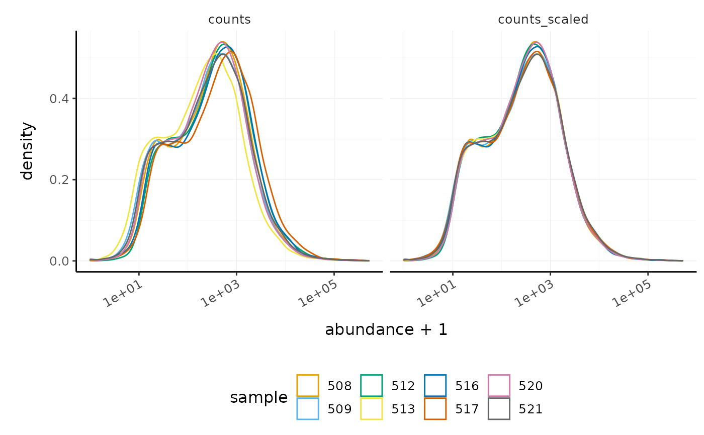
In this dataset the distributions of the counts are not very different to each other before scaling but scaling does make the distributions more similar. If we saw a sample with a very different distribution we may need to investigate it.
As tidybulk smoothly integrates with ggplot2 and other tidyverse packages it can save on typing and make plots easier to generate. Compare the code for creating density plots with tidybulk versus standard base R below (standard code adapted from (Law et al. 2016)).
tidybulk
# tidybulk
airway %>%
    tidybulk() %>%
  keep_abundant(factor_of_interest=dex) %>%
    scale_abundance() %>%
    pivot_longer(cols = c("counts", "counts_scaled"), names_to = "source", values_to = "abundance") %>%
    ggplot(aes(x=abundance + 1, color=sample)) +
    geom_density() +
    facet_wrap(~source) +
    scale_x_log10() +
    custom_theme
base R using edgeR
# Example code, no need to run

# Prepare data set
dgList <- SE2DGEList(airway)
group <- factor(dgList$samples$dex)
keep.exprs <- filterByExpr(dgList, group=group)
dgList <- dgList[keep.exprs,, keep.lib.sizes=FALSE]
nsamples <- ncol(dgList)
logcounts <- log2(dgList$counts)

# Setup graphics
col <- RColorBrewer::brewer.pal(nsamples, "Paired")
par(mfrow=c(1,2))

# Plot raw counts
plot(density(logcounts[,1]), col=col[1], lwd=2, ylim=c(0,0.26), las=2, main="", xlab="")
title(main="Counts")
for (i in 2:nsamples){
  den <- density(logcounts[,i])
  lines(den$x, den$y, col=col[i], lwd=2)
}
legend("topright", legend=dgList$samples$Run, text.col=col, bty="n")

# Plot scaled counts
dgList_norm <- calcNormFactors(dgList)
lcpm_n <- cpm(dgList_norm, log=TRUE)
plot(density(lcpm_n[,1]), col=col[1], lwd=2, ylim=c(0,0.26), las=2, main="", xlab="")
title("Counts scaled")
for (i in 2:nsamples){
  den <- density(lcpm_n[,i])
  lines(den$x, den$y, col=col[i], lwd=2)
}
legend("topright", legend=dgList_norm$samples$Run, text.col=col, bty="n")
Exploratory analyses
Dimensionality reduction
By far, one of the most important plots we make when we analyse RNA sequencing data are principal-component analysis (PCA) or multi-dimensional scaling (MDS) plots. We reduce the dimensions of the data to identify the greatest sources of variation in the data. A principal components analysis is an example of an unsupervised analysis, where we don’t need to specify the groups. If your experiment is well controlled and has worked well, what we hope to see is that the greatest sources of variation in the data are the treatments/groups we are interested in. It is also an incredibly useful tool for quality control and checking for outliers. We can use the reduce_dimensions function to calculate the dimensions.
# Get principal components
counts_scal_PCA <-
  counts_scaled %>%
  reduce_dimensions(method="PCA")
#> Getting the 500 most variable genes
#> Fraction of variance explained by the selected principal components
#> # A tibble: 2 x 2
#>   `Fraction of variance`    PC
#>                    <dbl> <int>
#> 1                  0.355     1
#> 2                  0.309     2
#> tidybulk says: to access the raw results do `attr(..., "internals")$PCA`
Poll: What fraction of variance is explained by PC3?
      See ?reduce_dimensions for how to get additional dimensions.
This joins the result to the counts object.
# Take a look
counts_scal_PCA
#> # A tibble: 127,408 x 19
#>    feature sample counts SampleName cell  dex   albut Run   avgLength Experiment
#>    <fct>   <chr>   <int> <fct>      <fct> <fct> <fct> <fct>     <int> <fct>
#>  1 ENSG00… 508       679 GSM1275862 N613… untrt untrt SRR1…       126 SRX384345
#>  2 ENSG00… 508       467 GSM1275862 N613… untrt untrt SRR1…       126 SRX384345
#>  3 ENSG00… 508       260 GSM1275862 N613… untrt untrt SRR1…       126 SRX384345
#>  4 ENSG00… 508        60 GSM1275862 N613… untrt untrt SRR1…       126 SRX384345
#>  5 ENSG00… 508      3251 GSM1275862 N613… untrt untrt SRR1…       126 SRX384345
#>  6 ENSG00… 508      1433 GSM1275862 N613… untrt untrt SRR1…       126 SRX384345
#>  7 ENSG00… 508       519 GSM1275862 N613… untrt untrt SRR1…       126 SRX384345
#>  8 ENSG00… 508       394 GSM1275862 N613… untrt untrt SRR1…       126 SRX384345
#>  9 ENSG00… 508       172 GSM1275862 N613… untrt untrt SRR1…       126 SRX384345
#> 10 ENSG00… 508      2112 GSM1275862 N613… untrt untrt SRR1…       126 SRX384345
#> # … with 127,398 more rows, and 9 more variables: Sample <fct>,
#> #   BioSample <fct>, symbol <chr>, .abundant <lgl>, TMM <dbl>,
#> #   multiplier <dbl>, counts_scaled <dbl>, PC1 <dbl>, PC2 <dbl>
For plotting, we can select just the sample-wise information with pivot_sample.
# take a look
counts_scal_PCA %>% pivot_sample()
#> # A tibble: 8 x 15
#>   sample SampleName cell  dex   albut Run   avgLength Experiment Sample
#>   <chr>  <fct>      <fct> <fct> <fct> <fct>     <int> <fct>      <fct>
#> 1 508    GSM1275862 N613… untrt untrt SRR1…       126 SRX384345  SRS50…
#> 2 509    GSM1275863 N613… trt   untrt SRR1…       126 SRX384346  SRS50…
#> 3 512    GSM1275866 N052… untrt untrt SRR1…       126 SRX384349  SRS50…
#> 4 513    GSM1275867 N052… trt   untrt SRR1…        87 SRX384350  SRS50…
#> 5 516    GSM1275870 N080… untrt untrt SRR1…       120 SRX384353  SRS50…
#> 6 517    GSM1275871 N080… trt   untrt SRR1…       126 SRX384354  SRS50…
#> 7 520    GSM1275874 N061… untrt untrt SRR1…       101 SRX384357  SRS50…
#> 8 521    GSM1275875 N061… trt   untrt SRR1…        98 SRX384358  SRS50…
#> # … with 6 more variables: BioSample <fct>, .abundant <lgl>, TMM <dbl>,
#> #   multiplier <dbl>, PC1 <dbl>, PC2 <dbl>
We can now plot the reduced dimensions.
# PCA plot
counts_scal_PCA %>%
    pivot_sample() %>%
    ggplot(aes(x=PC1, y=PC2, colour=dex, shape=cell)) +
    geom_point() +
    geom_text_repel(aes(label=sample), show.legend = FALSE) +
    custom_theme
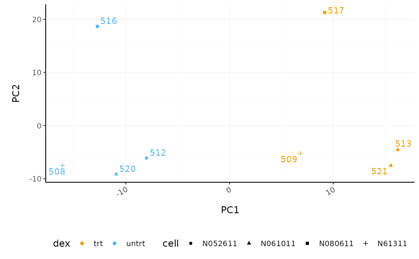
The samples separate by treatment on PC1 which is what we hope to see. PC2 separates the N080611 cell line from the other samples, indicating a greater difference between that cell line and the others.
Hierarchical clustering with heatmaps
An alternative to principal component analysis for examining relationships between samples is using hierarchical clustering. Heatmaps are a nice visualisation to examine hierarchical clustering of your samples. tidybulk has a simple function we can use, keep_variable, to extract the most variable genes which we can then plot with tidyHeatmap.
counts_scaled %>%

    # extract 500 most variable genes
    keep_variable(.abundance = counts_scaled, top = 500) %>%

    # create heatmap
    heatmap(
          .column = sample,
          .row = feature,
          .value = counts_scaled,
          transform = log1p
    ) %>%
        add_tile(dex) %>%
        add_tile(cell)
#> Getting the 500 most variable genes
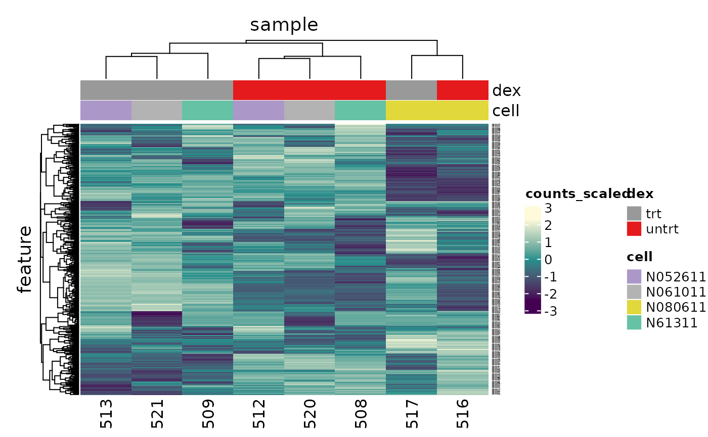
In the heatmap we can see the samples cluster into two groups, treated and untreated, for three of the cell lines, and the cell line (N080611) again is further away from the others.
Tidybulk enables a simplified way of generating a clustered heatmap of variable genes. Compare the code below for tidybulk versus a base R method.
base R using edgeR
# Example code, no need to run

dgList <- SE2DGEList(airway)
group <- factor(dgList$samples$dex)
keep.exprs <- filterByExpr(dgList, group=group)
dgList <- dgList[keep.exprs,, keep.lib.sizes=FALSE]
dgList <- calcNormFactors(dgList)
logcounts <- cpm(dgList, log=TRUE)
var_genes <- apply(logcounts, 1, var)
select_var <- names(sort(var_genes, decreasing=TRUE))[1:500]
highly_variable_lcpm <- logcounts[select_var,]
colours <- c("#440154FF", "#21908CFF", "#fefada" )
col.group <- c("red","grey")[group]
gplots::heatmap.2(highly_variable_lcpm, col=colours, trace="none", ColSideColors=col.group, scale="row")
Differential expression
Now that we are happy that the data looks good, we can continue to testing for differentially expressed (DE) genes. We will use the test_differential_abundance from tidybulk which currently uses edgeR (Robinson, McCarthy, and Smyth 2010) to perform the differential expression analysis. We give test_differential_abundance our tidybulk counts object and a formula, specifying the column that contains our groups to be compared. If all our samples were from the same cell line, and there were no additional factors contributing variance such as batch differences, we could use the formula 0 + dex. However, each treated and untreated sample is from a different cell line so we add the cell line as an additional factor 0 + dex + cell. We also provide the names of the groups we want to compare to .contrasts (e.g. .contrasts = c("dextreat - dexuntreat")).
We only have one contrast here so we omit the suffix.
counts_de <- counts_filtered %>%
    test_differential_abundance(
      .formula = ~ 0 + dex + cell,
      .contrasts = c("dextrt - dexuntrt"),
      omit_contrast_in_colnames = TRUE
    )
#> tidybulk says: All methods use raw counts,
#> irrespective of if scale_abundance or adjust_abundance have been calculated,
#> therefore it is essential to add covariates such as batch effects (if applicable) in the formula.
#> tidybulk says: The design column names are "dextrt, dexuntrt, cellN061011, cellN080611, cellN61311"
#> tidybulk says: to access the raw results (fitted GLM) do `attr(..., "internals")$edgeR`
The results will be joined to our counts for every sample.
# take a look
counts_de
#> # A tibble: 127,408 x 19
#>    feature sample counts SampleName cell  dex   albut Run   avgLength Experiment
#>    <chr>   <chr>   <int> <fct>      <fct> <fct> <fct> <fct>     <int> <fct>
#>  1 ENSG00… 508       679 GSM1275862 N613… untrt untrt SRR1…       126 SRX384345
#>  2 ENSG00… 508       467 GSM1275862 N613… untrt untrt SRR1…       126 SRX384345
#>  3 ENSG00… 508       260 GSM1275862 N613… untrt untrt SRR1…       126 SRX384345
#>  4 ENSG00… 508        60 GSM1275862 N613… untrt untrt SRR1…       126 SRX384345
#>  5 ENSG00… 508      3251 GSM1275862 N613… untrt untrt SRR1…       126 SRX384345
#>  6 ENSG00… 508      1433 GSM1275862 N613… untrt untrt SRR1…       126 SRX384345
#>  7 ENSG00… 508       519 GSM1275862 N613… untrt untrt SRR1…       126 SRX384345
#>  8 ENSG00… 508       394 GSM1275862 N613… untrt untrt SRR1…       126 SRX384345
#>  9 ENSG00… 508       172 GSM1275862 N613… untrt untrt SRR1…       126 SRX384345
#> 10 ENSG00… 508      2112 GSM1275862 N613… untrt untrt SRR1…       126 SRX384345
#> # … with 127,398 more rows, and 9 more variables: Sample <fct>,
#> #   BioSample <fct>, symbol <chr>, .abundant <lgl>, logFC <dbl>, logCPM <dbl>,
#> #   F <dbl>, PValue <dbl>, FDR <dbl>
If we just want a table of differentially expressed genes we can select the transcript-wise information with pivot_transcript.
# take a look
counts_de %>% pivot_transcript()
#> # A tibble: 15,926 x 9
#>    feature       albut symbol   .abundant   logFC logCPM       F  PValue     FDR
#>    <chr>         <fct> <chr>    <lgl>       <dbl>  <dbl>   <dbl>   <dbl>   <dbl>
#>  1 ENSG00000000… untrt TSPAN6   TRUE      -0.390    5.06 32.8    3.12e-4 0.00283
#>  2 ENSG00000000… untrt DPM1     TRUE       0.198    4.61  6.90   2.81e-2 0.0770
#>  3 ENSG00000000… untrt SCYL3    TRUE       0.0292   3.48  0.0969 7.63e-1 0.844
#>  4 ENSG00000000… untrt C1orf112 TRUE      -0.124    1.47  0.377  5.55e-1 0.682
#>  5 ENSG00000000… untrt CFH      TRUE       0.417    8.09 29.3    4.63e-4 0.00376
#>  6 ENSG00000001… untrt FUCA2    TRUE      -0.250    5.91 14.9    4.05e-3 0.0186
#>  7 ENSG00000001… untrt GCLC     TRUE      -0.0581   4.84  0.167  6.92e-1 0.794
#>  8 ENSG00000001… untrt NFYA     TRUE      -0.509    4.13 44.9    1.00e-4 0.00126
#>  9 ENSG00000001… untrt STPG1    TRUE      -0.136    3.12  1.04   3.35e-1 0.478
#> 10 ENSG00000001… untrt NIPAL3   TRUE      -0.0500   7.04  0.350  5.69e-1 0.695
#> # … with 15,916 more rows
Now we have columns with our log-fold change (logFC), false-discovery rate (FDR) and probability value (p-value). logFC is log2(treated/untreated).
Tidybulk enables a simplified way of performing an RNA sequencing differential expression analysis (with the benefit of smoothly integrating with ggplot2 and other tidyverse packages). Compare the code for a tidybulk edgeR analysis versus standard edgeR below.
standard edgeR
# Example code, no need to run

dgList <- SE2DGEList(airway)
group <- factor(dgList$samples$dex)
keep.exprs <- filterByExpr(dgList, group=group)
dgList <- dgList[keep.exprs,, keep.lib.sizes=FALSE]
dgList <- calcNormFactors(dgList)
cell <- factor(dgList$samples$cell)
design <- model.matrix(~ 0 + group + cell)
dgList <- estimateDisp(dgList, design)
fit <- glmQLFit(dgList, design)
TvsU <- makeContrasts(TvsU=grouptrt-groupuntrt, levels=design)
qlf <- glmQLFTest(fit, contrast=TvsU)
Table of differentially expressed genes
We can write out our differentially expressed genes to a file that can be loaded into e.g. Excel. write_tsv will create a tab-separated file.
# save results
counts_de %>%
    pivot_transcript() %>%
    write_tsv("de_results.tsv")
Counting differentially expressed genes
In order to decide which genes are differentially expressed, we usually take a cut-off of 0.05 on the FDR (or adjusted P value), NOT the raw p-value. This is because we are testing many genes (multiple testing), and the chances of finding differentially expressed genes is very high when you do that many tests. Hence we need to control the false discovery rate, which is the adjusted p-value column in the results table. What this means is that if 100 genes are significant at a 5% false discovery rate, we are willing to accept that 5 will be false positives.
We can count how many differentially expressed genes there are. We’ll filter on FDR 0.05.
counts_de %>%
  filter(FDR < 0.05) %>%
  summarise(num_de = n_distinct(feature))
#> # A tibble: 1 x 1
#>   num_de
#>    <int>
#> 1   4967
Poll: How many differentially expressed transcripts are there for FDR < 0.05 if we did not include cell line in the formula?Extracting top differentially expressed genes
We can see the top genes by smallest p-value. We’ll take a look at the top 6.
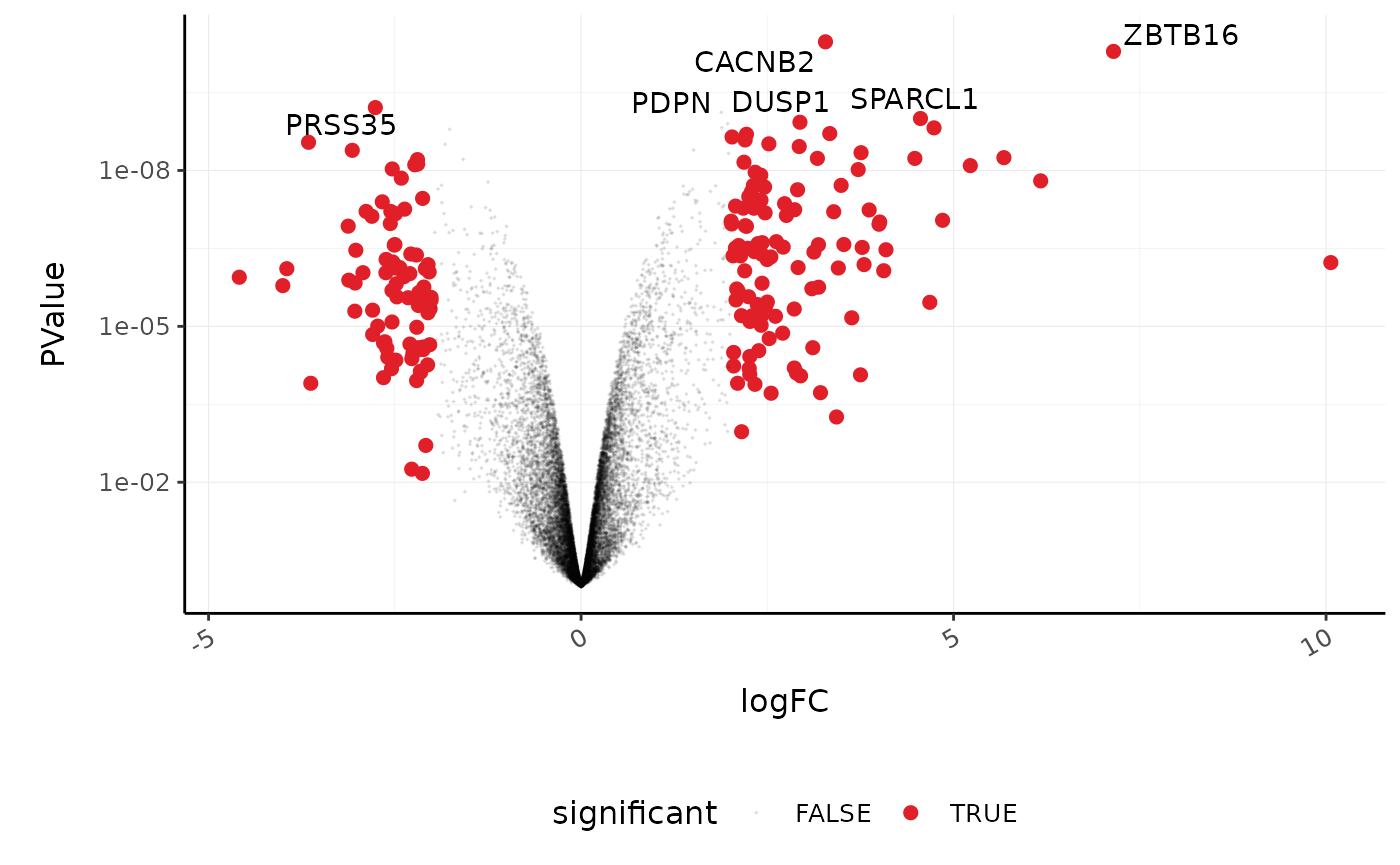
topgenes <-
    counts_de %>%
    pivot_transcript() %>%
    arrange(PValue) %>%
    head(6)

topgenes
#> # A tibble: 6 x 9
#>   feature         albut symbol  .abundant logFC logCPM     F   PValue        FDR
#>   <chr>           <fct> <chr>   <lgl>     <dbl>  <dbl> <dbl>    <dbl>      <dbl>
#> 1 ENSG00000165995 untrt CACNB2  TRUE       3.28   4.51 1575. 3.34e-11    4.07e-7
#> 2 ENSG00000109906 untrt ZBTB16  TRUE       7.15   4.15 1429. 5.11e-11    4.07e-7
#> 3 ENSG00000146250 untrt PRSS35  TRUE      -2.76   3.91  807. 6.16e-10    2.57e-6
#> 4 ENSG00000162493 untrt PDPN    TRUE       1.88   5.68  768. 7.60e-10    2.57e-6
#> 5 ENSG00000152583 untrt SPARCL1 TRUE       4.56   5.53  721. 1.00e- 9    2.57e-6
#> 6 ENSG00000120129 untrt DUSP1   TRUE       2.94   7.31  694. 1.18e- 9    2.57e-6
We can extract the symbols for these top genes to use in some of the plots we will make.
topgenes_symbols <- topgenes %>% pull(symbol)

# take a look
topgenes_symbols
#> ENSG00000165995 ENSG00000109906 ENSG00000146250 ENSG00000162493 ENSG00000152583
#>        "CACNB2"        "ZBTB16"        "PRSS35"          "PDPN"       "SPARCL1"
#> ENSG00000120129
#>         "DUSP1"
Plots after testing for differentially expressed
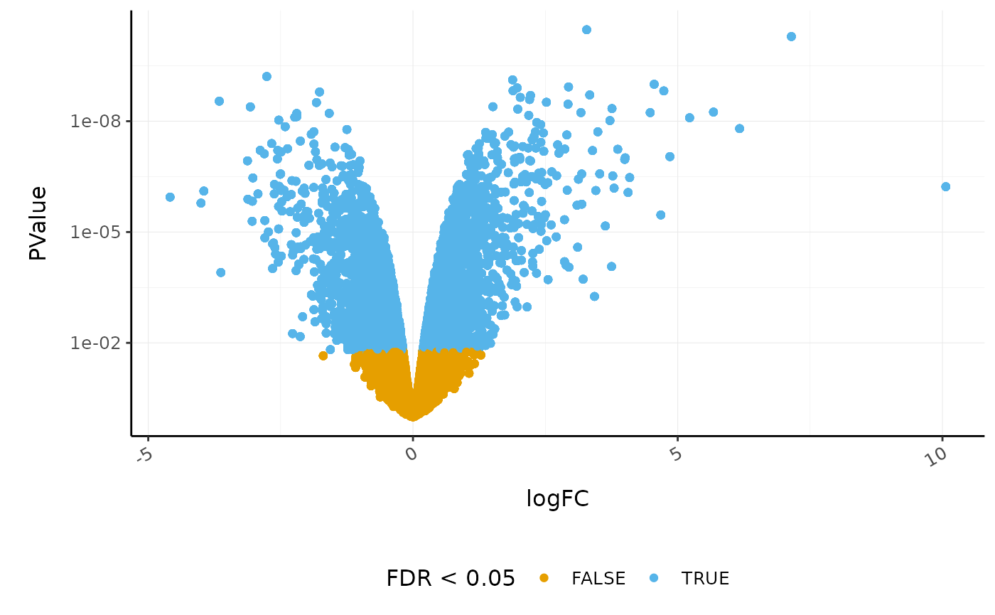
Volcano plots
Volcano plots are a useful genome-wide plot for checking that the analysis looks good. Volcano plots enable us to visualise the significance of change (p-value) versus the fold change (logFC). Highly significant genes are towards the top of the plot. We can also colour significant genes (e.g. genes with false-discovery rate < 0.05)
# volcano plot, minimal
counts_de %>%
    ggplot(aes(x=logFC, y=PValue, colour=FDR < 0.05)) +
    geom_point() +
    scale_y_continuous(trans = "log10_reverse") +
    custom_theme
A more informative plot, integrating some of the packages in tidyverse.
counts_de %>%
    pivot_transcript() %>%

  # Subset data
    mutate(significant = FDR<0.05 & abs(logFC) >=2) %>%
    mutate(symbol = ifelse(symbol %in% topgenes_symbols, as.character(symbol), "")) %>%

  # Plot
    ggplot(aes(x = logFC, y = PValue, label=symbol)) +
    geom_point(aes(color = significant, size = significant, alpha=significant)) +
    geom_text_repel() +

    # Custom scales
  custom_theme +
    scale_y_continuous(trans = "log10_reverse") +
    scale_color_manual(values=c("black", "#e11f28")) +
    scale_size_discrete(range = c(0, 2))
#> Scale for 'colour' is already present. Adding another scale for 'colour',
#> which will replace the existing scale.
Stripcharts
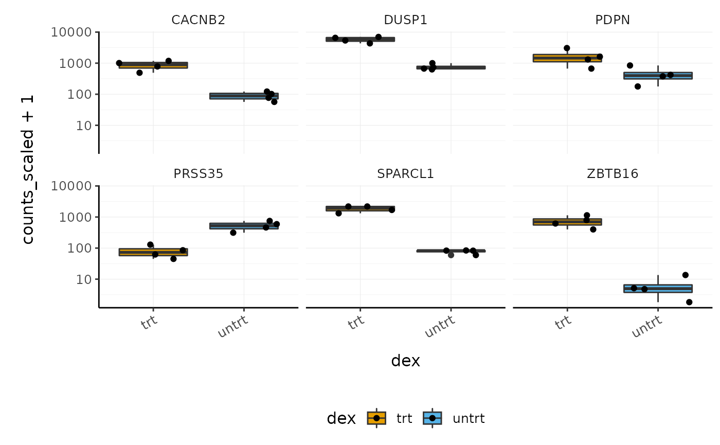
Before following up on the differentially expressed genes with further lab work, it is also recommended to have a look at the expression levels of the individual samples for the genes of interest. We can use stripcharts to do this. These will help show if expression is consistent amongst replicates in the groups.
With stripcharts we can see if replicates tend to group together and how the expression compares to the other groups. We’ll also add a box plot to show the distribution.
strip_chart <-
    counts_scaled %>%

    # extract counts for top differentially expressed genes
    filter(symbol %in% topgenes_symbols) %>%

    # make faceted stripchart
    ggplot(aes(x = dex, y = counts_scaled + 1, fill = dex, label = sample)) +
    geom_boxplot() +
    geom_jitter() +
    facet_wrap(~symbol) +
    scale_y_log10()+
    custom_theme

strip_chart
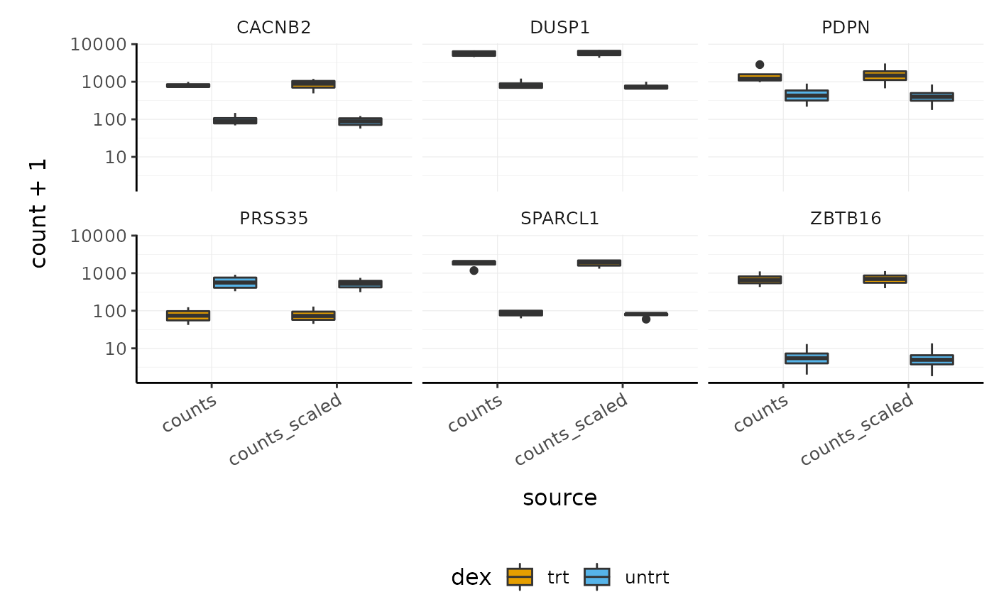
We can also easily check the raw and scaled counts for these genes.
counts_scaled %>%

  # extract counts for top differentially expressed genes
  filter(symbol %in% topgenes_symbols) %>%

  # reshape to create column ("source") containing the raw and scaled counts
  pivot_longer(
    c(counts, counts_scaled),
    names_to = "source",
    values_to = "count"
  ) %>%

  # make faceted stripchart
  ggplot(aes(x = source, y = count + 1, fill = dex)) +
    geom_boxplot() +
    facet_wrap(~symbol) +
    scale_y_log10() +
    custom_theme
Interactive Plots
A really nice feature of using tidyverse and ggplot2 is that we can make interactive plots quite easily using the plotly package. This can be very useful for exploring what genes or samples are in the plots. We can make interactive plots directly from our ggplot2 object (strip_chart). Having label in the aes is useful to visualise the identifier of the data point (here the sample id) or other variables when we hover over the plot.
We can also specify which parameters from the aes we want to show up when we hover over the plot with tooltip.
Automatic bibliography
Tidybulk provides a handy function called get_bibliography that you can use to obtain the references for the methods used. The references are in BibTeX format and can be imported into your reference manager.
get_bibliography(counts_de)
#> @article{wickham2019welcome,
#>   title={Welcome to the Tidyverse},
#>   author={Wickham, Hadley and Averick, Mara and Bryan, Jennifer and Chang, Winston and McGowan, Lucy D'Agostino and Francois, Romain and Grolemund, Garrett and Hayes, Alex and Henry, Lionel and Hester, Jim and others},
#>   journal={Journal of Open Source Software},
#>   volume={4},
#>   number={43},
#>   pages={1686},
#>   year={2019}
#>  }
#> @article{robinson2010edger,
#>   title={edgeR: a Bioconductor package for differential expression analysis of digital gene expression data},
#>   author={Robinson, Mark D and McCarthy, Davis J and Smyth, Gordon K},
#>   journal={Bioinformatics},
#>   volume={26},
#>   number={1},
#>   pages={139--140},
#>   year={2010},
#>   publisher={Oxford University Press}
#>  }
#> @incollection{smyth2005limma,
#>   title={Limma: linear models for microarray data},
#>   author={Smyth, Gordon K},
#>   booktitle={Bioinformatics and computational biology solutions using R and Bioconductor},
#>   pages={397--420},
#>   year={2005},
#>   publisher={Springer}
#>  }
Key Points
- RNA sequencing data can be represented and analysed in a ‘tidy’ way using tidybulk and the tidyverse
- With the modularity offered by piping we don’t need to create variables, unless an object is used more than one. This improves robustness of the code.
- The principles of tidy transcriptomics are to interface as much as possible with commonly known manipulation and visualisation tools, rather than creating custom functions.
- Some of the key steps in an RNA sequencing analysis are (i) filtering lowly abundant transcripts, (ii) adjusting for differences in sequencing depth and composition, (iii) testing for differential expression
- Dimensionality reduction (PCA or MDS) plots are very important for exploring the data
- Density plots, volcano plots, strip-charts and heatmaps are useful visualisation tools for evaluating the hypothesis testing.
Supplementary
Some things we don’t have time to cover in Part 1 of this workshop can be found in the Supplementary material.
Exercises
Try to apply what you’ve learned to another dataset. This dataset was generated from the pasilla package, which obtained the data from the paper by (Brooks et al. 2011). Here we provide it as a SummarizedExperiment object. The dataset has 7 samples from Drosophila (fruitfly): 3 treated with siRNA knockdown of the pasilla gene and 4 untreated controls, noted in column “condition”. Some of the samples have been sequenced with paired-end sequencing and some with single-end, noted in column “type”.
Load the data and create the tidybulk object with:
data("pasilla", package = "rpharma2020tidytranscriptomics")
counts_tt <-
    pasilla %>%
    tidybulk() %>%
    mutate(symbol = AnnotationDbi::mapIds(org.Dm.eg.db::org.Dm.eg.db, keys=as.character(feature), keytype = "FLYBASE", column="SYMBOL", multiVals = "first"))
#>
#> 'select()' returned 1:1 mapping between keys and columns
Poll:
1) What is the Fraction of Variance for PC1?
2) How many differentially expressed genes are there for treated vs untreated (FDR < 0.05)?
3) What is the FBgn id of the 10th most differentially expressed gene (by smallest P value)?
Extra
1.4 What code can generate a heatmap of variable genes (starting from count_scaled)?
1.5 What code can you use to visualise expression of the pasilla gene (gene id: FBgn0261552)
1.6 What code can generate an interactive volcano plot that has gene ids showing on hover?
1.7 What code can generate a heatmap of the top 100 differentially expressed genes?
Part 2 Bulk RNA-seq Extended
Tidybulk ADD versus GET modes
In this Part 2 we will see action="get" being used, so we will explain here what it is doing.
Every tidybulk function takes a tidybulk tibble as input, and
* action="add" outputs the new information joined to the original input data frame (default)
* action="get" outputs the new information with only the sample or transcript information, depending on what the analysis is
For example, with action="add" (default), we can add the PCA dimensions to the original data set. So we still have a row for every transcript in every sample.
counts_scaled %>%
  reduce_dimensions(
  method = "PCA",
  action = "add")
#> Getting the 500 most variable genes
#> Fraction of variance explained by the selected principal components
#> # A tibble: 2 x 2
#>   `Fraction of variance`    PC
#>                    <dbl> <int>
#> 1                  0.355     1
#> 2                  0.309     2
#> tidybulk says: to access the raw results do `attr(..., "internals")$PCA`
#> # A tibble: 127,408 x 19
#>    feature sample counts SampleName cell  dex   albut Run   avgLength Experiment
#>    <fct>   <chr>   <int> <fct>      <fct> <fct> <fct> <fct>     <int> <fct>
#>  1 ENSG00… 508       679 GSM1275862 N613… untrt untrt SRR1…       126 SRX384345
#>  2 ENSG00… 508       467 GSM1275862 N613… untrt untrt SRR1…       126 SRX384345
#>  3 ENSG00… 508       260 GSM1275862 N613… untrt untrt SRR1…       126 SRX384345
#>  4 ENSG00… 508        60 GSM1275862 N613… untrt untrt SRR1…       126 SRX384345
#>  5 ENSG00… 508      3251 GSM1275862 N613… untrt untrt SRR1…       126 SRX384345
#>  6 ENSG00… 508      1433 GSM1275862 N613… untrt untrt SRR1…       126 SRX384345
#>  7 ENSG00… 508       519 GSM1275862 N613… untrt untrt SRR1…       126 SRX384345
#>  8 ENSG00… 508       394 GSM1275862 N613… untrt untrt SRR1…       126 SRX384345
#>  9 ENSG00… 508       172 GSM1275862 N613… untrt untrt SRR1…       126 SRX384345
#> 10 ENSG00… 508      2112 GSM1275862 N613… untrt untrt SRR1…       126 SRX384345
#> # … with 127,398 more rows, and 9 more variables: Sample <fct>,
#> #   BioSample <fct>, symbol <chr>, .abundant <lgl>, TMM <dbl>,
#> #   multiplier <dbl>, counts_scaled <dbl>, PC1 <dbl>, PC2 <dbl>
Or with action= "get" we can add the PCA dimensions to the original data set selecting just the sample-wise columns. Note that we now have just one row for every sample.
counts_scaled %>%
  reduce_dimensions(
  method = "PCA",
  action = "get")
#> Getting the 500 most variable genes
#> Fraction of variance explained by the selected principal components
#> # A tibble: 2 x 2
#>   `Fraction of variance`    PC
#>                    <dbl> <int>
#> 1                  0.355     1
#> 2                  0.309     2
#> tidybulk says: to access the raw results do `attr(..., "internals")$PCA`
#> # A tibble: 8 x 15
#>   sample SampleName cell  dex   albut Run   avgLength Experiment Sample
#>   <chr>  <fct>      <fct> <fct> <fct> <fct>     <int> <fct>      <fct>
#> 1 508    GSM1275862 N613… untrt untrt SRR1…       126 SRX384345  SRS50…
#> 2 509    GSM1275863 N613… trt   untrt SRR1…       126 SRX384346  SRS50…
#> 3 512    GSM1275866 N052… untrt untrt SRR1…       126 SRX384349  SRS50…
#> 4 513    GSM1275867 N052… trt   untrt SRR1…        87 SRX384350  SRS50…
#> 5 516    GSM1275870 N080… untrt untrt SRR1…       120 SRX384353  SRS50…
#> 6 517    GSM1275871 N080… trt   untrt SRR1…       126 SRX384354  SRS50…
#> 7 520    GSM1275874 N061… untrt untrt SRR1…       101 SRX384357  SRS50…
#> 8 521    GSM1275875 N061… trt   untrt SRR1…        98 SRX384358  SRS50…
#> # … with 6 more variables: BioSample <fct>, .abundant <lgl>, TMM <dbl>,
#> #   multiplier <dbl>, PC1 <dbl>, PC2 <dbl>
Comparison of differential analysis methods
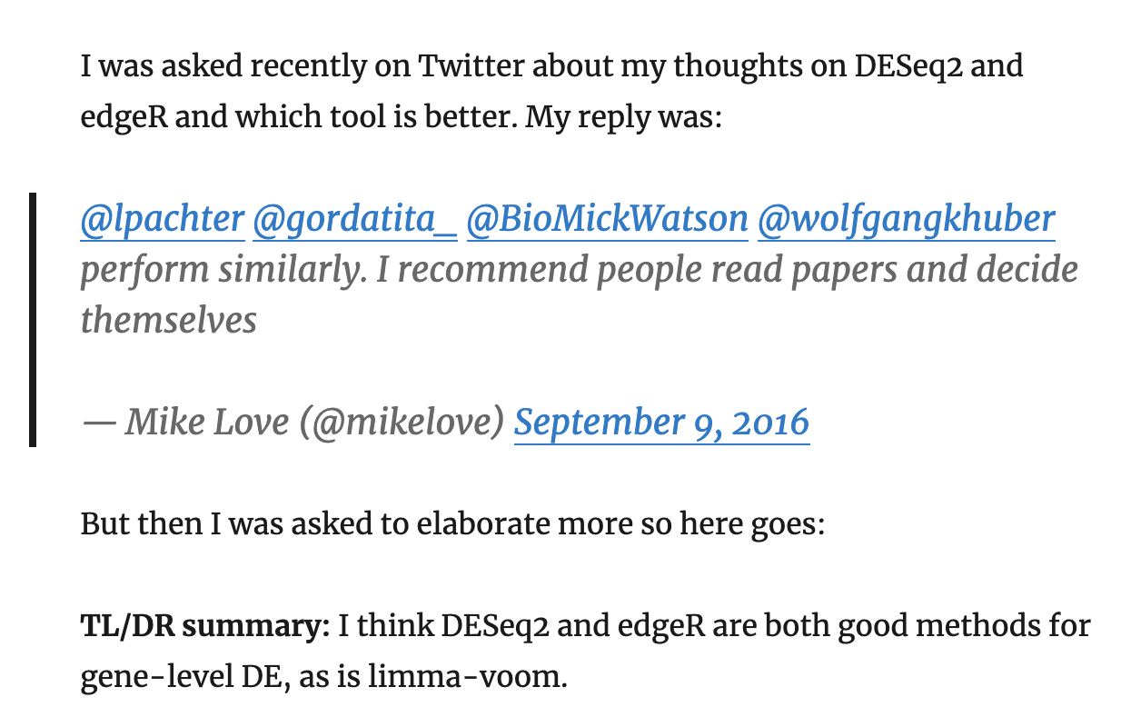
tidybulk integrates several popular methods for differential transcript abundance testing: the edgeR quasi-likelihood (Chen, Lun, and Smyth 2016) (tidybulk default method), edgeR likelihood ratio (McCarthy, Chen, and Smyth 2012), limma-voom (Law et al. 2014) and DESeq2 (Love, Huber, and Anders 2014). A common question researchers have is which method to choose. Mike Love, DESeq2 author has this advice in his blog.
tidybulk can help you decide which method (or methods) to use, as it provides an easy way to run multiple and see how they compare.
We can perform differential analysis with several methods, and the results will be added to the original dataset.
As before, we first pre-process the data, creating a tibble and identifying abundant genes.
pasilla_de <-
  rpharma2020tidytranscriptomics::pasilla %>%

  # Convert SummarizedExperiment object to tibble
  tidybulk() %>%

  # Add gene symbols
  mutate(symbol = AnnotationDbi::mapIds(org.Dm.eg.db::org.Dm.eg.db,   keys=as.character(feature), keytype = "FLYBASE", column="SYMBOL", multiVals = "first")) %>%

  # Filter counts
  keep_abundant(factor_of_interest=condition)
#> 'select()' returned 1:1 mapping between keys and columns
This is an example for the default method for differential abundance testing as we saw previously with the airway dataset. It uses the edgeR quasi-likelihood method.
pasilla_de %>%

  # Test differential composition
  test_differential_abundance(
    ~ condition + type,
    action="get"
  ) %>%

  # Sort by P value
  arrange(PValue)
#> tidybulk says: All methods use raw counts,
#> irrespective of if scale_abundance or adjust_abundance have been calculated,
#> therefore it is essential to add covariates such as batch effects (if applicable) in the formula.
#> tidybulk says: The design column names are "(Intercept), conditionuntreated, typesingle_end"
#> tidybulk says: to access the raw results (fitted GLM) do `attr(..., "internals")$edgeR`
#> # A tibble: 7,919 x 8
#>    feature     symbol .abundant logFC logCPM     F   PValue          FDR
#>    <chr>       <chr>  <lgl>     <dbl>  <dbl> <dbl>    <dbl>        <dbl>
#>  1 FBgn0025111 Ant2   TRUE      -2.86   6.92 1304. 2.37e-12 0.0000000149
#>  2 FBgn0039155 Kal1   TRUE       4.61   5.88 1194. 3.75e-12 0.0000000149
#>  3 FBgn0003360 sesB   TRUE       3.12   8.45  792. 3.17e-11 0.0000000837
#>  4 FBgn0035085 CG3770 TRUE       2.57   5.68  728. 4.89e-11 0.0000000968
#>  5 FBgn0039827 CG1544 TRUE       4.17   4.39  616. 1.16e-10 0.000000169
#>  6 FBgn0029167 Hml    TRUE       2.19   8.22  599. 1.34e-10 0.000000169
#>  7 FBgn0034736 gas    TRUE       3.52   4.18  586. 1.50e-10 0.000000169
#>  8 FBgn0026562 SPARC  TRUE       2.47  11.8   504. 3.27e-10 0.000000323
#>  9 FBgn0034434 <NA>   TRUE       3.63   3.21  390. 1.22e- 9 0.000000983
#> 10 FBgn0000071 Ama    TRUE      -2.63   4.79  389. 1.24e- 9 0.000000983
#> # … with 7,909 more rows
Now let’s try to perform multiple methods on the same dataset.
de_all <-

  pasilla_de %>%

  # edgeR QLT
  test_differential_abundance(
    ~ condition + type,
    method = "edger_quasi_likelihood",
    prefix = "edgerQLT_"
  )  %>%

  # edgeR LRT
  test_differential_abundance(
    ~ condition + type,
    method = "edger_likelihood_ratio",
    prefix = "edgerLR_"
  )  %>%

  # limma-voom
  test_differential_abundance(
    ~ condition + type,
    method = "limma_voom",
    prefix = "voom_"
  ) %>%

  # DESeq2
  test_differential_abundance(
    ~ condition + type,
    method = "deseq2",
    prefix = "deseq2_"
  )

# take a look

de_all
#> # A tibble: 55,433 x 29
#>    feature sample counts condition type  symbol .abundant edgerQLT_logFC
#>    <chr>   <fct>   <int> <fct>     <fct> <chr>  <lgl>              <dbl>
#>  1 FBgn00… untrt1     92 untreated sing… a      TRUE              0.0337
#>  2 FBgn00… untrt1   4664 untreated sing… Abl    TRUE              0.249
#>  3 FBgn00… untrt1    583 untreated sing… abo    TRUE              0.0569
#>  4 FBgn00… untrt1   1446 untreated sing… Acph-1 TRUE              0.0402
#>  5 FBgn00… untrt1     15 untreated sing… mAChR… TRUE             -0.387
#>  6 FBgn00… untrt1 101664 untreated sing… Act5C  TRUE             -0.310
#>  7 FBgn00… untrt1  33402 untreated sing… Act42A TRUE             -0.617
#>  8 FBgn00… untrt1     21 untreated sing… Act57B TRUE             -0.491
#>  9 FBgn00… untrt1     12 untreated sing… Act87E TRUE             -0.610
#> 10 FBgn00… untrt1   3026 untreated sing… Pfas   TRUE              0.163
#> # … with 55,423 more rows, and 21 more variables: edgerQLT_logCPM <dbl>,
#> #   edgerQLT_F <dbl>, edgerQLT_PValue <dbl>, edgerQLT_FDR <dbl>,
#> #   edgerLR_logFC <dbl>, edgerLR_logCPM <dbl>, edgerLR_LR <dbl>,
#> #   edgerLR_PValue <dbl>, edgerLR_FDR <dbl>, voom_logFC <dbl>,
#> #   voom_AveExpr <dbl>, voom_t <dbl>, voom_P.Value <dbl>, voom_adj.P.Val <dbl>,
#> #   voom_B <dbl>, deseq2_baseMean <dbl>, deseq2_log2FoldChange <dbl>,
#> #   deseq2_lfcSE <dbl>, deseq2_stat <dbl>, deseq2_pvalue <dbl>,
#> #   deseq2_padj <dbl>
Note
You may notice that the methods produce columns with different names for similar outputs. If you wish to make these consistent you can do that with tidyverse
rename. For example, to rename the p value adjusted columns you could run below.
de_all %>% rename(deseq2_FDR = deseq2_padj, voom_FDR = voom_adj.P.Val)
Which method detects the most differentially abundant transcripts, p value adjusted for multiple testing < 0.05 (FDR, adj.P.Val, padj)?We can visually compare the log fold change (logFC) of transcript abundance for the comparison of interest (treated vs untreated) for all methods. We will notice that the consistency of the logFC is really high for the methods.
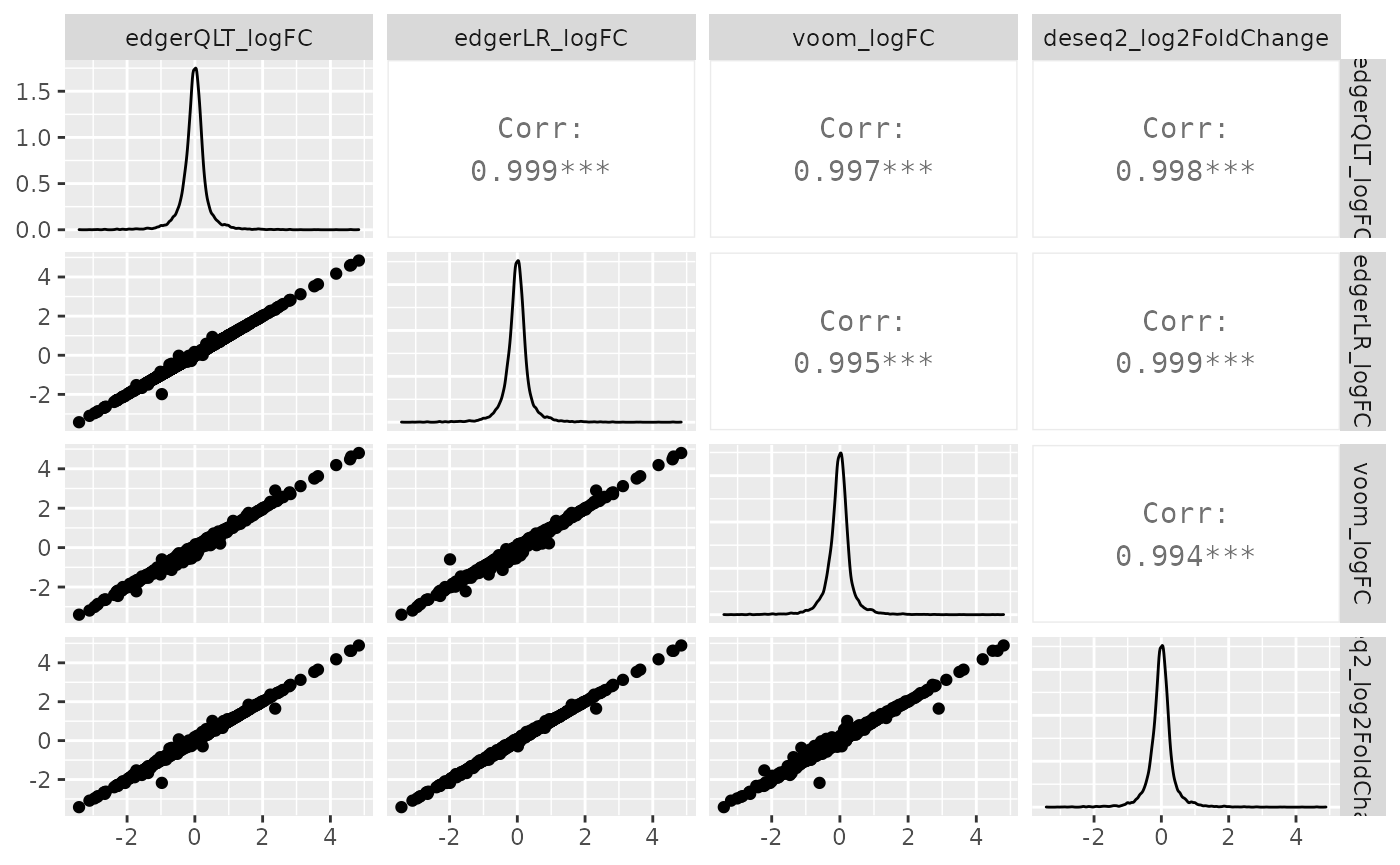
de_all %>%
  pivot_transcript() %>%
  select(edgerQLT_logFC, edgerLR_logFC, voom_logFC, deseq2_log2FoldChange, feature) %>%
  ggpairs(1:4)
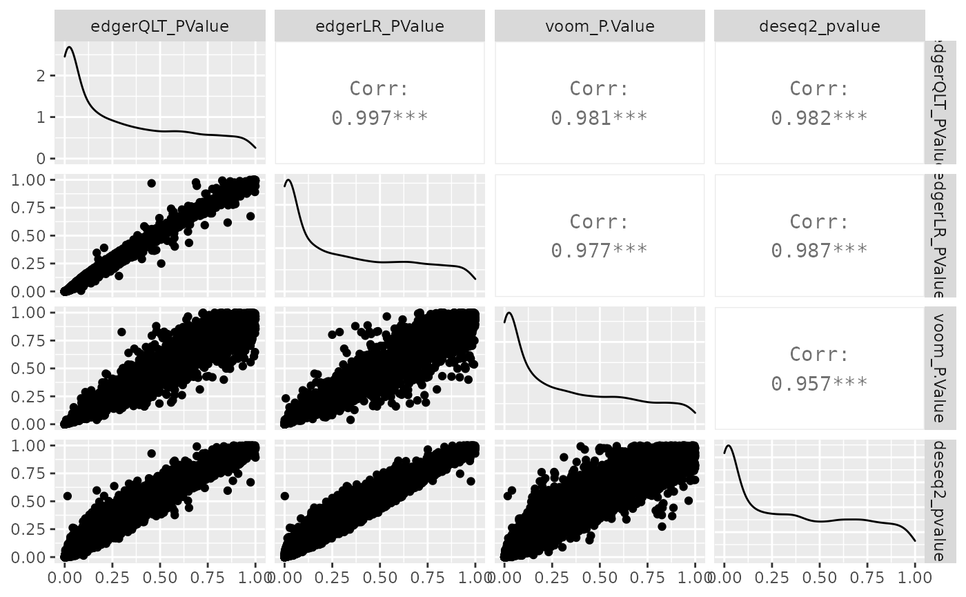
Similarly, we can visually compare the significance for all methods. In this case the difference is larger.
de_all %>%
  pivot_transcript() %>%
  select(edgerQLT_PValue, edgerLR_PValue, voom_P.Value, deseq2_pvalue, feature) %>%
  ggpairs(1:4)
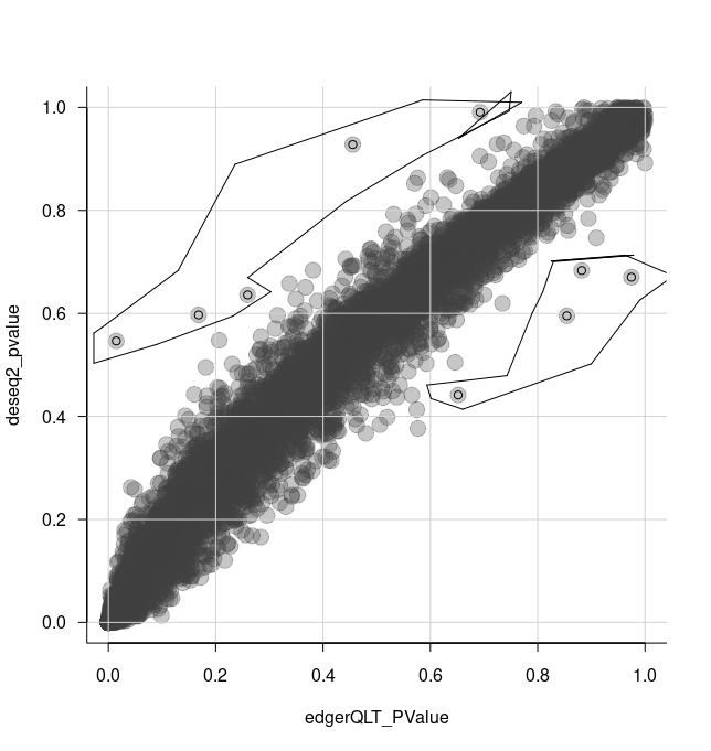
We can select some of the transcripts for further analysis using the tidygate package.
With tidygate, we can interactively draw gates to select points we want using gate. We specify which columns we want to plot in the scatterplot, and how many gates we want to draw. We can also specify the opacity if we want to make it easier to see overlapping points.
de_gate <-
  de_all %>%

  gate(
    feature,
    edgerQLT_PValue,
    deseq2_pvalue,
    opacity=0.3,
    how_many_gates = 2
  )
We then click to draw gates around the points we want, for example as shown in the screenshot below.
 That will add a column called gate, specifying which gate the points (transcripts) are in.
#> # A tibble: 55,433 x 30
#>    feature sample counts condition type  symbol .abundant edgerQLT_logFC
#>    <chr>   <fct>   <int> <fct>     <fct> <chr>  <lgl>              <dbl>
#>  1 FBgn00… untrt1     92 untreated sing… a      TRUE              0.0337
#>  2 FBgn00… untrt1   4664 untreated sing… Abl    TRUE              0.249
#>  3 FBgn00… untrt1    583 untreated sing… abo    TRUE              0.0569
#>  4 FBgn00… untrt1   1446 untreated sing… Acph-1 TRUE              0.0402
#>  5 FBgn00… untrt1     15 untreated sing… mAChR… TRUE             -0.387
#>  6 FBgn00… untrt1 101664 untreated sing… Act5C  TRUE             -0.310
#>  7 FBgn00… untrt1  33402 untreated sing… Act42A TRUE             -0.617
#>  8 FBgn00… untrt1     21 untreated sing… Act57B TRUE             -0.491
#>  9 FBgn00… untrt1     12 untreated sing… Act87E TRUE             -0.610
#> 10 FBgn00… untrt1   3026 untreated sing… Pfas   TRUE              0.163
#> # … with 55,423 more rows, and 22 more variables: edgerQLT_logCPM <dbl>,
#> #   edgerQLT_F <dbl>, edgerQLT_PValue <dbl>, edgerQLT_FDR <dbl>,
#> #   edgerLR_logFC <dbl>, edgerLR_logCPM <dbl>, edgerLR_LR <dbl>,
#> #   edgerLR_PValue <dbl>, edgerLR_FDR <dbl>, voom_logFC <dbl>,
#> #   voom_AveExpr <dbl>, voom_t <dbl>, voom_P.Value <dbl>, voom_adj.P.Val <dbl>,
#> #   voom_B <dbl>, deseq2_baseMean <dbl>, deseq2_log2FoldChange <dbl>,
#> #   deseq2_lfcSE <dbl>, deseq2_stat <dbl>, deseq2_pvalue <dbl>,
#> #   deseq2_padj <dbl>, gate <chr>
We can check how many transcripts we’ve got in each gate.
de_gate %>%
    pivot_transcript() %>%
    dplyr::count(gate)
#> # A tibble: 3 x 2
#>   gate      n
#>   <chr> <int>
#> 1 0      7910
#> 2 1         5
#> 3 2         4
We can now select the transcripts from our two gates i.e. more significant in edgeR (gate 1) and more significant in DESeq2 (gate 2).
de_gate %>%

  # Generate scaled counts for plotting
  scale_abundance() %>%

  # Filter for transcripts within the gates
  filter(gate > 0) %>%

  # Rename for clarity
  mutate(gate = case_when(
    gate == 1 ~ "more in edgeR",
    gate == 2 ~ "more in DESeq2",
    TRUE ~ gate
  )) %>%

  # Order the plots for the transcripts
  mutate(feature = fct_reorder(feature, edgerQLT_PValue, min)) %>%

  # Plot
  ggplot(aes(condition, counts_scaled, color=gate)) +
  geom_point() +
  facet_wrap(~feature, scale="free_y") +
  custom_theme
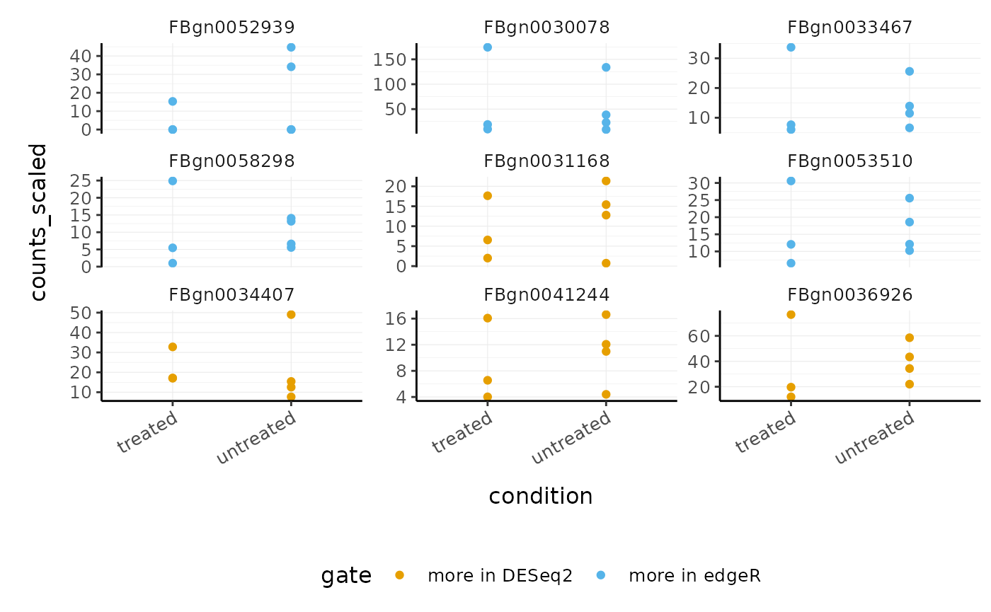
This enables us to see, for example, that DESeq2 produces a more conservative logFC statistic for the transcript FBgn0052939 .
Cell type composition analysis
If we are sequencing tissue samples, we may want to know what cell types are present and if there are differences in expression between them. tidybulk has a deconvolve_cellularity function that can help us do this.
For this example we will use a subset of the breast cancer dataset from The Cancer Genome Atlas (TCGA).
BRCA_tidy <-
    rpharma2020tidytranscriptomics::BRCA %>%
    tidybulk(patient, transcript, count)

BRCA_tidy
#> # A tibble: 198,374 x 5
#>    patient      transcript count  time event_occurred
#>    <fct>        <fct>      <int> <dbl>          <int>
#>  1 TCGA-C8-A275 C1orf112    1571     1              0
#>  2 TCGA-C8-A275 FGR         1873     1              0
#>  3 TCGA-C8-A275 FUCA2       3770     1              0
#>  4 TCGA-C8-A275 GCLC        2738     1              0
#>  5 TCGA-C8-A275 LAS1L       3175     1              0
#>  6 TCGA-C8-A275 ENPP4       1340     1              0
#>  7 TCGA-C8-A275 SEMA3F      5479     1              0
#>  8 TCGA-C8-A275 RAD52        472     1              0
#>  9 TCGA-C8-A275 BAD         1761     1              0
#> 10 TCGA-C8-A275 CD99       14697     1              0
#> # … with 198,364 more rows
With tidybulk, we can easily infer the proportions of cell types within a tissue using one of several published methods (Cibersort (Newman et al. 2015), EPIC (Racle et al. 2017) and llsr (Abbas et al. 2009)). Here we will use Cibersort which provides a default signature called LM22 to define the cell types. LM22 contains 547 genes that identify 22 human immune cell types.
BRCA_cell_type <-
    BRCA_tidy %>%
    deconvolve_cellularity(action="get")
#> Installing e1071 needed for Cibersort
#> Installing package into '/tmp/RtmpAeJEgs/temp_libpath1fe3677511e4'
#> (as 'lib' is unspecified)

BRCA_cell_type
#> # A tibble: 22 x 25
#>    patient  time event_occurred `cibersort: B c… `cibersort: B c…
#>    <chr>   <dbl>          <int>            <dbl>            <dbl>
#>  1 TCGA-C…     1              0          0.0325            0
#>  2 TCGA-A…     1              0          0.0170            0
#>  3 TCGA-A…     5              0          0.00127           0
#>  4 TCGA-C…     5              0          0.0372            0
#>  5 TCGA-P…     5              0          0.00453           0
#>  6 TCGA-B…  6292              0          0.144             0
#>  7 TCGA-B…  7106              0          0.0632            0
#>  8 TCGA-B…  7777              0          0                 0.0142
#>  9 TCGA-B…  8008              0          0.203             0
#> 10 TCGA-B…  8391              0          0.147             0
#> # … with 12 more rows, and 20 more variables: `cibersort: Plasma cells` <dbl>,
#> #   `cibersort: T cells CD8` <dbl>, `cibersort: T cells CD4 naive` <dbl>,
#> #   `cibersort: T cells CD4 memory resting` <dbl>, `cibersort: T cells CD4
#> #   memory activated` <dbl>, `cibersort: T cells follicular helper` <dbl>,
#> #   `cibersort: T cells regulatory (Tregs)` <dbl>, `cibersort: T cells gamma
#> #   delta` <dbl>, `cibersort: NK cells resting` <dbl>, `cibersort: NK cells
#> #   activated` <dbl>, `cibersort: Monocytes` <dbl>, `cibersort: Macrophages
#> #   M0` <dbl>, `cibersort: Macrophages M1` <dbl>, `cibersort: Macrophages
#> #   M2` <dbl>, `cibersort: Dendritic cells resting` <dbl>, `cibersort:
#> #   Dendritic cells activated` <dbl>, `cibersort: Mast cells resting` <dbl>,
#> #   `cibersort: Mast cells activated` <dbl>, `cibersort: Eosinophils` <dbl>,
#> #   `cibersort: Neutrophils` <dbl>
Cell type proportions are added to the tibble as new columns. The prefix makes it easy to reshape the data frame if needed, for visualisation or further analyses.
BRCA_cell_type_long <-
    BRCA_cell_type %>%

    # Reshape
    pivot_longer(
        contains("cibersort"),
        names_prefix = "cibersort: ",
        names_to = "cell_type",
        values_to = "proportion"
    )

BRCA_cell_type_long
#> # A tibble: 484 x 5
#>    patient       time event_occurred cell_type                    proportion
#>    <chr>        <dbl>          <int> <chr>                             <dbl>
#>  1 TCGA-C8-A275     1              0 B cells naive                    0.0325
#>  2 TCGA-C8-A275     1              0 B cells memory                   0
#>  3 TCGA-C8-A275     1              0 Plasma cells                     0.0127
#>  4 TCGA-C8-A275     1              0 T cells CD8                      0
#>  5 TCGA-C8-A275     1              0 T cells CD4 naive                0.0507
#>  6 TCGA-C8-A275     1              0 T cells CD4 memory resting       0.0299
#>  7 TCGA-C8-A275     1              0 T cells CD4 memory activated     0.0332
#>  8 TCGA-C8-A275     1              0 T cells follicular helper        0
#>  9 TCGA-C8-A275     1              0 T cells regulatory (Tregs)       0.0326
#> 10 TCGA-C8-A275     1              0 T cells gamma delta              0.0247
#> # … with 474 more rows
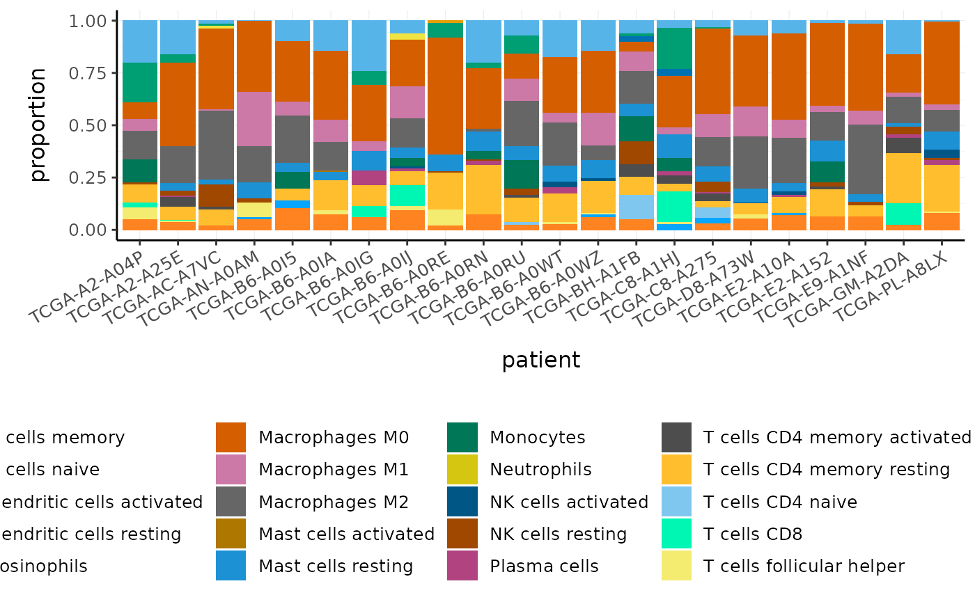
We can plot the proportions of immune cell types for each patient.
BRCA_cell_type_long %>%

  # Plot proportions
  ggplot(aes(x=patient, y=proportion, fill=cell_type)) +
  geom_bar(stat = "identity") +
  custom_theme
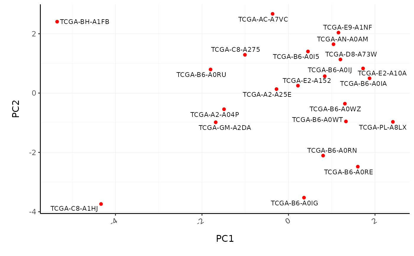
We can visualise the similarity of the tissue composition for the patients by performing a dimensionality reduction on cell type and proportion (rather than on transcript and counts as we did previously).
BRCA_cell_type_long %>%

    # Filter cell types with proportion zero in all patients
    group_by(cell_type) %>%
    filter(sum(proportion) > 0) %>%
    ungroup() %>%

    reduce_dimensions(
        patient,
        cell_type,
        proportion,
        method="PCA",
        action="get"
    ) %>%

    ggplot(aes(PC1, PC2, label=patient)) +
    geom_point(color="red") +
    ggrepel::geom_text_repel(size=3) +
    custom_theme
#> Getting the 21 most variable genes
#> Fraction of variance explained by the selected principal components
#> # A tibble: 2 x 2
#>   `Fraction of variance`    PC
#>                    <dbl> <int>
#> 1                  0.183     1
#> 2                  0.152     2
#> tidybulk says: to access the raw results do `attr(..., "internals")$PCA`
Poll: What is the most abundant cell type overall in BRCA samples?We can also perform differential tissue composition analyses, similar to how we performed differential transcript abundance analyses. We use tidybulk’s test_differential_cellularity and can perform our analyses using a known factor of interest, such as tumour subtype, or using survival data. Here we use survival data available from TCGA (Liu et al. 2018).
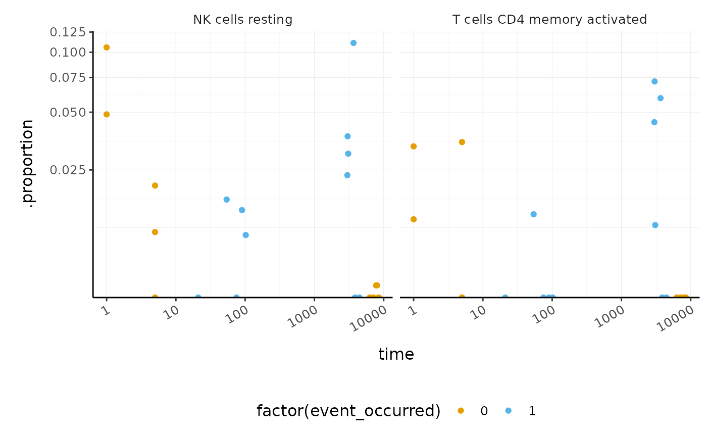
library(survival)

BRCA_tidy_survival <-
    BRCA_tidy %>%
    test_differential_cellularity(Surv(time, event_occurred) ~ .    ) %>%
    arrange(p.value)
#> Installing broom needed for analyses
#> Installing package into '/tmp/RtmpAeJEgs/temp_libpath1fe3677511e4'
#> (as 'lib' is unspecified)

BRCA_tidy_survival %>%
    dplyr::select(.cell_type, p.value, everything())
#> # A tibble: 22 x 6
#>    .cell_type            p.value cell_type_proport… estimate std.error statistic
#>    <chr>                   <dbl> <list>                <dbl>     <dbl>     <dbl>
#>  1 NK cells resting       0.0863 <tibble [22 × 6]>     0.330     0.192     1.72
#>  2 T cells CD4 memory a…  0.0884 <tibble [22 × 6]>     0.313     0.184     1.70
#>  3 Mast cells resting     0.150  <tibble [22 × 6]>    -0.379     0.264    -1.44
#>  4 T cells CD4 memory r…  0.161  <tibble [22 × 6]>    -0.865     0.617    -1.40
#>  5 Macrophages M2         0.164  <tibble [22 × 6]>     0.365     0.262     1.39
#>  6 T cells gamma delta    0.291  <tibble [22 × 6]>    -0.534     0.506    -1.06
#>  7 T cells regulatory (…  0.330  <tibble [22 × 6]>    -0.496     0.509    -0.975
#>  8 T cells follicular h…  0.372  <tibble [22 × 6]>    -0.205     0.229    -0.893
#>  9 Macrophages M0         0.520  <tibble [22 × 6]>    -0.248     0.385    -0.643
#> 10 T cells CD4 naive      0.579  <tibble [22 × 6]>     0.113     0.204     0.555
#> # … with 12 more rows
We can visualise the proportions for the cell types most associated with survival.
BRCA_tidy_survival %>%
    dplyr::slice(1:2) %>%
    unnest(cell_type_proportions) %>%
    ggplot(aes(time, .proportion, color = factor(event_occurred))) +
    geom_point() +
    facet_wrap(~ .cell_type) +
    scale_x_log10() +
    scale_y_continuous(trans = "logit") +
    custom_theme
#> Warning: Transformation introduced infinite values in continuous y-axis
Key Points
-
tidybulkallows streamlined multi-method analyses -
tidygateallows the selection of arbitrary points in a two-dimensional plot, and add the gate information to the input tibble -
tidybulkallow easy analyses of cell type composition - Testing for differences in tissue composition between samples is analogous to the testing for differences in transcript abundance
Supplementary
Some things we don’t have time to cover in Part 2 of this workshop can be found in the Supplementary material.
Part 3 Single-cell RNA-seq
[Background information] (https://stemangiola.github.io/rpharma2020_tidytranscriptomics/articles/background.html#differences-between-bulk-and-single-cell-rna-sequencing-1)
In Part 2 we showed how we can study the cell-type composition of a biological sample using bulk RNA sequencing. Single cell sequencing enables a more direct estimation of cell-type composition and gives greater resolution. For bulk RNA sequencing we need to infer the cell types using the abundance of transcripts in the whole sample, with single-cell RNA sequencing we can directly measure the transcripts in each cell and then classify the cells into cell types.
Seurat is a very popular analysis toolkit for single cell RNA sequencing data (Butler et al. 2018; Stuart et al. 2019) .
tidyseurat provides a bridge between the Seurat single-cell package (Butler et al. 2018; Stuart et al. 2019) and the tidyverse (Wickham et al. 2019). It creates an invisible layer that enables viewing the Seurat object as a tidyverse tibble, and provides Seurat-compatible dplyr, tidyr, ggplot and plotly functions.
# load additional libraries
library(rpharma2020tidytranscriptomics)
library(dplyr)
library(purrr)
library(stringr)
library(Seurat)
library(SingleR)
library(tidyseurat)
Create tidyseurat
This is a seurat object but it is evaluated as tibble. So it is fully compatible both with Seurat and tidyverse APIs.
pbmc_small_tidy <- rpharma2020tidytranscriptomics::pbmc_small %>% tidy()
It looks like a tibble
pbmc_small_tidy
#> # A tibble: 80 x 9
#>    cell  orig.ident nCount_RNA nFeature_RNA RNA_snn_res.0.8 letter.idents groups
#>    <chr> <fct>           <dbl>        <int> <fct>           <fct>         <chr>
#>  1 ATGC… SeuratPro…         70           47 0               A             g2
#>  2 CATG… SeuratPro…         85           52 0               A             g1
#>  3 GAAC… SeuratPro…         87           50 1               B             g2
#>  4 TGAC… SeuratPro…        127           56 0               A             g2
#>  5 AGTC… SeuratPro…        173           53 0               A             g2
#>  6 TCTG… SeuratPro…         70           48 0               A             g1
#>  7 TGGT… SeuratPro…         64           36 0               A             g1
#>  8 GCAG… SeuratPro…         72           45 0               A             g1
#>  9 GATA… SeuratPro…         52           36 0               A             g1
#> 10 AATG… SeuratPro…        100           41 0               A             g1
#> # … with 70 more rows, and 2 more variables: RNA_snn_res.1 <fct>, file <chr>
But it is a Seurat object after all
Assays(pbmc_small_tidy)
#> [1] "RNA"
Polish the data
We can interact with our object as we do with any tibble. In this case we want to polish an annotation column.
pbmc_small_tidy_clean <-
    pbmc_small_tidy %>%

    # Clean groups
    mutate(groups = groups %>% str_remove("^g")) %>%

    # Extract sample
    extract(file, "sample", "../data/sample([a-z0-9]+)/outs.+")

pbmc_small_tidy_clean
#> # A tibble: 80 x 9
#>    cell  orig.ident nCount_RNA nFeature_RNA RNA_snn_res.0.8 letter.idents groups
#>    <chr> <fct>           <dbl>        <int> <fct>           <fct>         <chr>
#>  1 ATGC… SeuratPro…         70           47 0               A             2
#>  2 CATG… SeuratPro…         85           52 0               A             1
#>  3 GAAC… SeuratPro…         87           50 1               B             2
#>  4 TGAC… SeuratPro…        127           56 0               A             2
#>  5 AGTC… SeuratPro…        173           53 0               A             2
#>  6 TCTG… SeuratPro…         70           48 0               A             1
#>  7 TGGT… SeuratPro…         64           36 0               A             1
#>  8 GCAG… SeuratPro…         72           45 0               A             1
#>  9 GATA… SeuratPro…         52           36 0               A             1
#> 10 AATG… SeuratPro…        100           41 0               A             1
#> # … with 70 more rows, and 2 more variables: RNA_snn_res.1 <fct>, sample <chr>
Preprocess the dataset
pbmc_small_scaled <-
  pbmc_small_tidy_clean %>%
  SCTransform(verbose = FALSE) %>%
  FindVariableFeatures(verbose = FALSE)

pbmc_small_scaled
#> # A tibble: 80 x 11
#>    cell  orig.ident nCount_RNA nFeature_RNA RNA_snn_res.0.8 letter.idents groups
#>    <chr> <fct>           <dbl>        <int> <fct>           <fct>         <chr>
#>  1 ATGC… SeuratPro…         70           47 0               A             2
#>  2 CATG… SeuratPro…         85           52 0               A             1
#>  3 GAAC… SeuratPro…         87           50 1               B             2
#>  4 TGAC… SeuratPro…        127           56 0               A             2
#>  5 AGTC… SeuratPro…        173           53 0               A             2
#>  6 TCTG… SeuratPro…         70           48 0               A             1
#>  7 TGGT… SeuratPro…         64           36 0               A             1
#>  8 GCAG… SeuratPro…         72           45 0               A             1
#>  9 GATA… SeuratPro…         52           36 0               A             1
#> 10 AATG… SeuratPro…        100           41 0               A             1
#> # … with 70 more rows, and 4 more variables: RNA_snn_res.1 <fct>, sample <chr>,
#> #   nCount_SCT <dbl>, nFeature_SCT <int>
Reduce dimensions
Beside PCA which is a linear dimensionality reduction, we can apply neighbour aware methods such as UMAP, to better define locally similar cells. We can calculate the first 3 UMAP dimensions using the Seurat framework.
pbmc_small_UMAP <-
  pbmc_small_scaled %>%
  RunPCA(verbose = FALSE) %>%
  RunUMAP(reduction = "pca", dims = 1:15, n.components = 3L)
#> Warning in irlba(A = t(x = object), nv = npcs, ...): You're computing too large
#> a percentage of total singular values, use a standard svd instead.
#> Warning: The default method for RunUMAP has changed from calling Python UMAP via reticulate to the R-native UWOT using the cosine metric
#> To use Python UMAP via reticulate, set umap.method to 'umap-learn' and metric to 'correlation'
#> This message will be shown once per session
#> 12:41:57 UMAP embedding parameters a = 0.9922 b = 1.112
#> 12:41:57 Read 80 rows and found 15 numeric columns
#> 12:41:57 Using Annoy for neighbor search, n_neighbors = 30
#> 12:41:57 Building Annoy index with metric = cosine, n_trees = 50
#> 0%   10   20   30   40   50   60   70   80   90   100%
#> [----|----|----|----|----|----|----|----|----|----|
#> **************************************************|
#> 12:41:57 Writing NN index file to temp file /tmp/RtmpQGJRrp/file21556ce5e270
#> 12:41:57 Searching Annoy index using 1 thread, search_k = 3000
#> 12:41:57 Annoy recall = 100%
#> 12:41:58 Commencing smooth kNN distance calibration using 1 thread
#> 12:42:00 Initializing from normalized Laplacian + noise
#> 12:42:00 Commencing optimization for 500 epochs, with 2040 positive edges
#> 12:42:01 Optimization finished
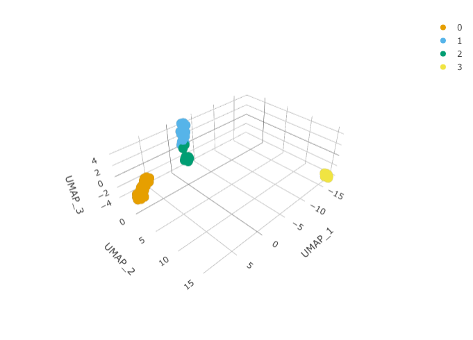
And we can plot them using 3D plot using plotly.
pbmc_small_UMAP %>%
  plot_ly(
    x = ~`UMAP_1`,
    y = ~`UMAP_2`,
    z = ~`UMAP_3`,
    colors = friendly_cols[1:4]
  )
Identify clusters
We proceed with cluster identification with Seurat.
pbmc_small_cluster <-
  pbmc_small_UMAP %>%
  FindNeighbors(verbose = FALSE) %>%
  FindClusters(method = "igraph", verbose = FALSE)

pbmc_small_cluster
#> # A tibble: 80 x 21
#>    cell  orig.ident nCount_RNA nFeature_RNA RNA_snn_res.0.8 letter.idents groups
#>    <chr> <fct>           <dbl>        <int> <fct>           <fct>         <chr>
#>  1 ATGC… SeuratPro…         70           47 0               A             2
#>  2 CATG… SeuratPro…         85           52 0               A             1
#>  3 GAAC… SeuratPro…         87           50 1               B             2
#>  4 TGAC… SeuratPro…        127           56 0               A             2
#>  5 AGTC… SeuratPro…        173           53 0               A             2
#>  6 TCTG… SeuratPro…         70           48 0               A             1
#>  7 TGGT… SeuratPro…         64           36 0               A             1
#>  8 GCAG… SeuratPro…         72           45 0               A             1
#>  9 GATA… SeuratPro…         52           36 0               A             1
#> 10 AATG… SeuratPro…        100           41 0               A             1
#> # … with 70 more rows, and 14 more variables: RNA_snn_res.1 <fct>,
#> #   sample <chr>, nCount_SCT <dbl>, nFeature_SCT <int>, SCT_snn_res.0.8 <fct>,
#> #   seurat_clusters <fct>, PC_1 <dbl>, PC_2 <dbl>, PC_3 <dbl>, PC_4 <dbl>,
#> #   PC_5 <dbl>, UMAP_1 <dbl>, UMAP_2 <dbl>, UMAP_3 <dbl>
Now we can interrogate the object as if it was a regular tibble data frame.
pbmc_small_cluster %>%
  count(sample, groups, seurat_clusters)
#> tidyseurat says: A data frame is returned for independent data analysis.
#> # A tibble: 8 x 4
#>   sample groups seurat_clusters     n
#>   <chr>  <chr>  <fct>           <int>
#> 1 1      1      0                  17
#> 2 1      1      1                  14
#> 3 1      1      2                   9
#> 4 1      1      3                   4
#> 5 2      2      0                  13
#> 6 2      2      1                  12
#> 7 2      2      2                   6
#> 8 2      2      3                   5
Manual cell type classification
We can identify cluster markers using Seurat.
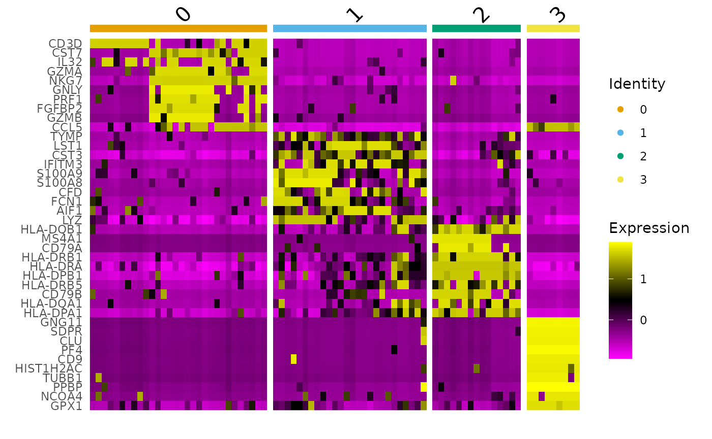
# Identify top 10 markers per cluster
markers <-
  pbmc_small_cluster %>%
  FindAllMarkers(only.pos = TRUE, min.pct = 0.25, thresh.use = 0.25) %>%
  group_by(cluster) %>%
  top_n(10, avg_logFC)
#> Calculating cluster 0
#> Calculating cluster 1
#> Calculating cluster 2
#> Calculating cluster 3

markers
#> # A tibble: 40 x 7
#> # Groups:   cluster [4]
#>       p_val avg_logFC pct.1 pct.2    p_val_adj cluster gene
#>       <dbl>     <dbl> <dbl> <dbl>        <dbl> <fct>   <chr>
#>  1 5.63e-11      1.48 0.7    0.02 0.0000000124 0       CD3D
#>  2 7.19e-10      1.17 0.667  0.04 0.000000158  0       CST7
#>  3 7.88e-10      1.52 0.667  0.04 0.000000173  0       IL32
#>  4 3.59e- 9      1.42 0.6    0.02 0.000000791  0       GZMA
#>  5 1.32e- 8      2.43 0.7    0.14 0.00000290   0       NKG7
#>  6 1.85e- 7      1.98 0.5    0.02 0.0000407    0       GNLY
#>  7 5.11e- 7      1.44 0.533  0.06 0.000112     0       PRF1
#>  8 1.88e- 6      1.15 0.5    0.06 0.000414     0       FGFBP2
#>  9 2.31e- 5      1.34 0.433  0.06 0.00508      0       GZMB
#> 10 5.86e- 5      1.37 0.633  0.22 0.0129       0       CCL5
#> # … with 30 more rows

# Plot heatmap
pbmc_small_cluster %>%
  DoHeatmap(
    features = markers$gene,
    group.colors = friendly_cols
  )
Automatic cell type classification
We can infer cell type identities using SingleR (Aran et al. 2019) and manipulate the output using tidyverse. SingleR accepts any log-normalised transcript abundance matrix
# Get cell type reference data
hpca <- HumanPrimaryCellAtlasData()

# Infer cell identities
cell_type_df <-

# extracting counts from Seurat object
  pbmc_small_cluster@assays[["SCT"]]@counts %>%
  log1p() %>%

    # SingleR
  SingleR(
    ref = hpca,
    labels = hpca$label.main,
    method = "cluster",
    clusters = pbmc_small_cluster %>% pull(seurat_clusters)
  ) %>%

    # Formatting results
  as.data.frame() %>%
  as_tibble(rownames = "seurat_clusters") %>%
  select(seurat_clusters, first.labels)
# Join UMAP and cell type info
pbmc_small_cell_type <-
  pbmc_small_cluster %>%
  left_join(
    rpharma2020tidytranscriptomics::cell_type_df,
    by = "seurat_clusters"
  )

# Reorder columns
pbmc_small_cell_type %>%
  select(cell, first.labels, everything())
#> # A tibble: 80 x 22
#>    cell  first.labels orig.ident nCount_RNA nFeature_RNA RNA_snn_res.0.8
#>    <chr> <chr>        <fct>           <dbl>        <int> <fct>
#>  1 ATGC… NK_cell      SeuratPro…         70           47 0
#>  2 CATG… NK_cell      SeuratPro…         85           52 0
#>  3 GAAC… NK_cell      SeuratPro…         87           50 1
#>  4 TGAC… NK_cell      SeuratPro…        127           56 0
#>  5 AGTC… NK_cell      SeuratPro…        173           53 0
#>  6 TCTG… NK_cell      SeuratPro…         70           48 0
#>  7 TGGT… NK_cell      SeuratPro…         64           36 0
#>  8 GCAG… NK_cell      SeuratPro…         72           45 0
#>  9 GATA… NK_cell      SeuratPro…         52           36 0
#> 10 AATG… NK_cell      SeuratPro…        100           41 0
#> # … with 70 more rows, and 16 more variables: letter.idents <fct>,
#> #   groups <chr>, RNA_snn_res.1 <fct>, sample <chr>, nCount_SCT <dbl>,
#> #   nFeature_SCT <int>, SCT_snn_res.0.8 <fct>, seurat_clusters <chr>,
#> #   PC_1 <dbl>, PC_2 <dbl>, PC_3 <dbl>, PC_4 <dbl>, PC_5 <dbl>, UMAP_1 <dbl>,
#> #   UMAP_2 <dbl>, UMAP_3 <dbl>
We can easily summarise the results. For example, we can see how cell type classification overlaps with cluster classification.
pbmc_small_cell_type %>%
  count(seurat_clusters, first.labels)
#> tidyseurat says: A data frame is returned for independent data analysis.
#> # A tibble: 4 x 3
#>   seurat_clusters first.labels     n
#>   <chr>           <chr>        <int>
#> 1 0               NK_cell         30
#> 2 1               Monocyte        26
#> 3 2               B_cell          15
#> 4 3               Platelets        9
Nested analyses
A powerful tool we can use with tidyseurat is nest. We can easily perform independent analyses on subsets of the dataset. First we classify cell types in lymphoid and myeloid; then, nest based on the new classification
pbmc_small_nested <-
  pbmc_small_cell_type %>%
  filter(first.labels != "Platelets") %>%
  mutate(cell_class = if_else(`first.labels` %in% c("Macrophage", "Monocyte"), "myeloid", "lymphoid")) %>%
  nest(data = -cell_class)

pbmc_small_nested
#> # A tibble: 2 x 2
#>   cell_class data
#>   <chr>      <list>
#> 1 lymphoid   <tidysert>
#> 2 myeloid    <tidysert>
Now we can independently for the lymphoid and myeloid subsets (i) find variable features, (ii) reduce dimensions, and (iii) cluster using both tidyverse and Seurat seamlessly.
pbmc_small_nested_reanalysed <-
  pbmc_small_nested %>%
  mutate(data = map(
    data, ~ .x %>%
      FindVariableFeatures(verbose = FALSE) %>%
      RunPCA(npcs = 10, verbose = FALSE) %>%
      FindNeighbors(verbose = FALSE) %>%
      FindClusters(method = "igraph", verbose = FALSE)
  ))

pbmc_small_nested_reanalysed
#> # A tibble: 2 x 2
#>   cell_class data
#>   <chr>      <list>
#> 1 lymphoid   <tidysert>
#> 2 myeloid    <tidysert>
Key Points
- Some basic steps of a single-cell RNA sequencing analysis are dimensionality reduction, cluster identification and cell type classification
-
tidyseuratis an invisible layer that operates on aSeuratobject and enables us to visualise and manipulate data as if it were a tidy data frame. -
tidyseuratobject is aSeurat objectso it can be used with anySeuratcompatible method
Contributing
If you want to suggest improvements for this workshop or ask questions, you can do so as described here.
Reproducibility
Record package and version information with sessionInfo
sessionInfo()
#> R version 4.0.2 (2020-06-22)
#> Platform: x86_64-pc-linux-gnu (64-bit)
#> Running under: Ubuntu 20.04 LTS
#>
#> Matrix products: default
#> BLAS/LAPACK: /usr/lib/x86_64-linux-gnu/openblas-pthread/libopenblasp-r0.3.8.so
#>
#> locale:
#>  [1] LC_CTYPE=en_US.UTF-8       LC_NUMERIC=C
#>  [3] LC_TIME=en_US.UTF-8        LC_COLLATE=en_US.UTF-8
#>  [5] LC_MONETARY=en_US.UTF-8    LC_MESSAGES=C
#>  [7] LC_PAPER=en_US.UTF-8       LC_NAME=C
#>  [9] LC_ADDRESS=C               LC_TELEPHONE=C
#> [11] LC_MEASUREMENT=en_US.UTF-8 LC_IDENTIFICATION=C
#>
#> attached base packages:
#> [1] parallel  stats4    stats     graphics  grDevices utils     datasets
#> [8] methods   base
#>
#> other attached packages:
#>  [1] tidyseurat_0.1.8                     SingleR_1.3.10
#>  [3] Seurat_3.2.2                         purrr_0.3.4
#>  [5] rpharma2020tidytranscriptomics_1.1.1 survival_3.2-7
#>  [7] GGally_2.0.0                         tidygate_0.2.8
#>  [9] forcats_0.5.0                        tidybulk_1.1.8
#> [11] tidyHeatmap_1.1.5                    ggrepel_0.8.2
#> [13] plotly_4.9.2.1                       ggplot2_3.3.2
#> [15] stringr_1.4.0                        readr_1.4.0
#> [17] tidyr_1.1.2                          dplyr_1.0.2
#> [19] tibble_3.0.3                         airway_1.9.0
#> [21] SummarizedExperiment_1.19.9          Biobase_2.49.1
#> [23] GenomicRanges_1.41.6                 GenomeInfoDb_1.25.11
#> [25] IRanges_2.23.10                      S4Vectors_0.27.13
#> [27] BiocGenerics_0.35.4                  MatrixGenerics_1.1.3
#> [29] matrixStats_0.57.0
#>
#> loaded via a namespace (and not attached):
#>   [1] utf8_1.1.4                  reticulate_1.16
#>   [3] tidyselect_1.1.0            RSQLite_2.2.1
#>   [5] AnnotationDbi_1.51.3        htmlwidgets_1.5.2
#>   [7] grid_4.0.2                  BiocParallel_1.23.2
#>   [9] Rtsne_0.15                  munsell_0.5.0
#>  [11] codetools_0.2-16            ragg_0.4.0
#>  [13] ica_1.0-2                   preprocessCore_1.51.0
#>  [15] future_1.19.1               miniUI_0.1.1.1
#>  [17] withr_2.3.0                 colorspace_1.4-1
#>  [19] knitr_1.30                  SingleCellExperiment_1.11.8
#>  [21] ROCR_1.0-11                 tensor_1.5
#>  [23] listenv_0.8.0               labeling_0.3
#>  [25] GenomeInfoDbData_1.2.4      polyclip_1.10-0
#>  [27] bit64_4.0.5                 farver_2.0.3
#>  [29] pheatmap_1.0.12             rprojroot_1.3-2
#>  [31] vctrs_0.3.4                 generics_0.0.2
#>  [33] xfun_0.18                   dittoSeq_1.1.9
#>  [35] R6_2.4.1                    clue_0.3-57
#>  [37] rsvd_1.0.3                  locfit_1.5-9.4
#>  [39] bitops_1.0-6                spatstat.utils_1.17-0
#>  [41] reshape_0.8.8               DelayedArray_0.15.15
#>  [43] assertthat_0.2.1            promises_1.1.1
#>  [45] scales_1.1.1                gtable_0.3.0
#>  [47] beachmat_2.5.8              globals_0.13.0
#>  [49] goftest_1.2-2               rlang_0.4.7
#>  [51] genefilter_1.71.0           systemfonts_0.3.2
#>  [53] GlobalOptions_0.1.2         splines_4.0.2
#>  [55] lazyeval_0.2.2              broom_0.7.1
#>  [57] yaml_2.2.1                  reshape2_1.4.4
#>  [59] abind_1.4-5                 crosstalk_1.1.0.1
#>  [61] backports_1.1.10            httpuv_1.5.4
#>  [63] tools_4.0.2                 ellipsis_0.3.1
#>  [65] RColorBrewer_1.1-2          ggridges_0.5.2
#>  [67] Rcpp_1.0.5                  plyr_1.8.6
#>  [69] zlibbioc_1.35.0             RCurl_1.98-1.2
#>  [71] rpart_4.1-15                deldir_0.1-29
#>  [73] pbapply_1.4-3               GetoptLong_1.0.3
#>  [75] viridis_0.5.1               cowplot_1.1.0
#>  [77] zoo_1.8-8                   cluster_2.1.0
#>  [79] fs_1.5.0                    magrittr_1.5
#>  [81] RSpectra_0.16-0             data.table_1.13.0
#>  [83] circlize_0.4.10             lmtest_0.9-38
#>  [85] RANN_2.6.1                  fitdistrplus_1.1-1
#>  [87] hms_0.5.3                   patchwork_1.0.1
#>  [89] mime_0.9                    evaluate_0.14
#>  [91] xtable_1.8-4                XML_3.99-0.5
#>  [93] gridExtra_2.3               shape_1.4.5
#>  [95] compiler_4.0.2              KernSmooth_2.23-17
#>  [97] crayon_1.3.4                htmltools_0.5.0
#>  [99] mgcv_1.8-33                 later_1.1.0.1
#> [101] geneplotter_1.67.0          DBI_1.1.0
#> [103] ComplexHeatmap_2.5.5        MASS_7.3-53
#> [105] rappdirs_0.3.1              boot_1.3-25
#> [107] Matrix_1.2-18               cli_2.0.2
#> [109] igraph_1.2.5                pkgconfig_2.0.3
#> [111] pkgdown_1.6.1               annotate_1.67.1
#> [113] XVector_0.29.3              digest_0.6.25
#> [115] sctransform_0.3             RcppAnnoy_0.0.16
#> [117] spatstat.data_1.4-3         rmarkdown_2.4
#> [119] leiden_0.3.3                uwot_0.1.8
#> [121] edgeR_3.31.4                DelayedMatrixStats_1.11.1
#> [123] shiny_1.5.0                 rjson_0.2.20
#> [125] lifecycle_0.2.0             nlme_3.1-149
#> [127] jsonlite_1.7.1              org.Dm.eg.db_3.11.4
#> [129] BiocNeighbors_1.7.0         desc_1.2.0
#> [131] viridisLite_0.3.0           limma_3.45.14
#> [133] fansi_0.4.1                 pillar_1.4.6
#> [135] lattice_0.20-41             fastmap_1.0.1
#> [137] httr_1.4.2                  glue_1.4.2
#> [139] spatstat_1.64-1             png_0.1-7
#> [141] bit_4.0.4                   stringi_1.5.3
#> [143] blob_1.2.1                  textshaping_0.1.1
#> [145] BiocSingular_1.5.2          DESeq2_1.29.14
#> [147] org.Hs.eg.db_3.11.4         memoise_1.1.0
#> [149] irlba_2.3.3                 future.apply_1.6.0
References
Abbas, Alexander R, Kristen Wolslegel, Dhaya Seshasayee, Zora Modrusan, and Hilary F Clark. 2009. “Deconvolution of Blood Microarray Data Identifies Cellular Activation Patterns in Systemic Lupus Erythematosus.” PloS One 4 (7): e6098.
Aran, Dvir, Agnieszka P Looney, Leqian Liu, Esther Wu, Valerie Fong, Austin Hsu, Suzanna Chak, et al. 2019. “Reference-Based Analysis of Lung Single-Cell Sequencing Reveals a Transitional Profibrotic Macrophage.” Nature Immunology 20 (2): 163–72.
Brooks, Angela N, Li Yang, Michael O Duff, Kasper D Hansen, Jung W Park, Sandrine Dudoit, Steven E Brenner, and Brenton R Graveley. 2011. “Conservation of an Rna Regulatory Map Between Drosophila and Mammals.” Genome Research 21 (2): 193–202.
Butler, Andrew, Paul Hoffman, Peter Smibert, Efthymia Papalexi, and Rahul Satija. 2018. “Integrating Single-Cell Transcriptomic Data Across Different Conditions, Technologies, and Species.” Nature Biotechnology 36 (5): 411–20.
Chen, Yunshun, Aaron TL Lun, and Gordon K Smyth. 2016. “From Reads to Genes to Pathways: Differential Expression Analysis of Rna-Seq Experiments Using Rsubread and the edgeR Quasi-Likelihood Pipeline.” F1000Research 5.
Himes, Blanca E, Xiaofeng Jiang, Peter Wagner, Ruoxi Hu, Qiyu Wang, Barbara Klanderman, Reid M Whitaker, et al. 2014. “RNA-Seq Transcriptome Profiling Identifies Crispld2 as a Glucocorticoid Responsive Gene That Modulates Cytokine Function in Airway Smooth Muscle Cells.” PloS One 9 (6): e99625.
Law, Charity W, Monther Alhamdoosh, Shian Su, Xueyi Dong, Luyi Tian, Gordon K Smyth, and Matthew E Ritchie. 2016. “RNA-Seq Analysis Is Easy as 1-2-3 with Limma, Glimma and edgeR.” F1000Research 5.
Law, Charity W, Yunshun Chen, Wei Shi, and Gordon K Smyth. 2014. “Voom: Precision Weights Unlock Linear Model Analysis Tools for Rna-Seq Read Counts.” Genome Biology 15 (2): R29.
Liu, Jianfang, Tara Lichtenberg, Katherine A Hoadley, Laila M Poisson, Alexander J Lazar, Andrew D Cherniack, Albert J Kovatich, et al. 2018. “An Integrated Tcga Pan-Cancer Clinical Data Resource to Drive High-Quality Survival Outcome Analytics.” Cell 173 (2): 400–416.
Love, Michael I, Wolfgang Huber, and Simon Anders. 2014. “Moderated Estimation of Fold Change and Dispersion for Rna-Seq Data with Deseq2.” Genome Biology 15 (12): 550.
Mangiola, Stefano, and Anthony T Papenfuss. 2020. “TidyHeatmap: An R Package for Modular Heatmap Production Based on Tidy Principles.” Journal of Open Source Software 5 (52): 2472.
McCarthy, Davis J, Yunshun Chen, and Gordon K Smyth. 2012. “Differential Expression Analysis of Multifactor Rna-Seq Experiments with Respect to Biological Variation.” Nucleic Acids Research 40 (10): 4288–97.
Newman, Aaron M, Chih Long Liu, Michael R Green, Andrew J Gentles, Weiguo Feng, Yue Xu, Chuong D Hoang, Maximilian Diehn, and Ash A Alizadeh. 2015. “Robust Enumeration of Cell Subsets from Tissue Expression Profiles.” Nature Methods 12 (5): 453–57.
Racle, Julien, Kaat de Jonge, Petra Baumgaertner, Daniel E Speiser, and David Gfeller. 2017. “Simultaneous Enumeration of Cancer and Immune Cell Types from Bulk Tumor Gene Expression Data.” Elife 6: e26476.
Robinson, Mark D, Davis J McCarthy, and Gordon K Smyth. 2010. “EdgeR: A Bioconductor Package for Differential Expression Analysis of Digital Gene Expression Data.” Bioinformatics 26 (1): 139–40.
Robinson, Mark D, and Alicia Oshlack. 2010. “A Scaling Normalization Method for Differential Expression Analysis of Rna-Seq Data.” Genome Biology 11 (3): 1–9.
Stuart, Tim, Andrew Butler, Paul Hoffman, Christoph Hafemeister, Efthymia Papalexi, William M Mauck III, Yuhan Hao, Marlon Stoeckius, Peter Smibert, and Rahul Satija. 2019. “Comprehensive Integration of Single-Cell Data.” Cell 177 (7): 1888–1902.
Wickham, Hadley, Mara Averick, Jennifer Bryan, Winston Chang, Lucy D’Agostino McGowan, Romain François, Garrett Grolemund, et al. 2019. “Welcome to the Tidyverse.” Journal of Open Source Software 4 (43): 1686.
Wickham, Hadley, and others. 2014. “Tidy Data.” Journal of Statistical Software 59 (10): 1–23.